Scrolling

If you move to Gothenburg in Sweden, you could live like this!

I mean, seriously - look at this place! It's 184 square metres (1980 square feet) of pure heaven. I'm already picturing myself swanning (because that surely what's you'd in an elegant apartment like this, swan!) from room to spacious room, the parquet floor softly creaking under foot! Fires would crackle away in the wood burning stoves, casting shadows on the lavish 19th century period features! It's Monday, I'm in love! Let's take a tour and then decide which one of us will move in and invite the other for fika (and the odd party!). Deal?!


Be still, beating heart. I do believe it's a Grand Air love seat (Gen has one in her living room and I couldn't get out of it the entire shoot!). The rug is from Tisca. I also spy a Pion light by Hay.


I really love how the doors, doorframe and skirting boards have been painted in a mid-grey, it adds a contemporary touch to the room and helps to highlight the details of the magnificent doors. 

I'm all into blue velvet sofas right now having installed one in my own sitting room last week - are you a fan too? I'm not sure where this one is from (love the studs!) - any idea?

We have a rubber plant like this at home too. We call it 'Farfar' (which means Father's Father or 'Grandad' in Swedish) since Per inherited it from his grandfather who passed away many years ago. It's an amazing plant!

These Swedish masonry ovens are just so beautiful, don't you think? They are amazingly efficient too (the tiles retain their heat long after the fire has gone out).


Are you convinced yet?! 

I'd move in in a heartbeat!

Other fabulous historical properties to enjoy today:

A vintage inspired Swedish home full of soul (this one is soooo charming!)

I hope you have a great start to the week, I've got a feeling this one is going to be a great one!

Niki

PS - I've had SO many questions about the Bemz covers from Friday's post. If you're stuck on which fabric to choose, I'd advise ordering a few samples. They're very quick to send them out and you should still be able to order in time to receive the 25% discount. 

Photographs courtesy of Entrance, with thanks.

Twitter FaceBook

Pin It
3

My Sitting Room Three Different ways

Partnership. The most popular room in our home at this time of the year has to be our sitting room. It's where we chill out, watch TV (yes, there is one hiding in this room somewhere, can you guess where?!), play games and chat into the early hours all winter long.  

In my childhood home, my Mother insisted on two antique chesterfields which looked stunning - but didn't move an inch when you sat down - do you know the type?! God forbid if you were to sit on one of the arms (there'd be an almighty cracking sound!)! In our sitting room we might not benefit from the history that comes with antique sofas - but boy is our IKEA Söderhamn 3-seater, armchair and chaise longues comfy! 

We can also update the furniture whenever it starts to look tired thanks to Bemz (who create custom covers and legs for IKEA furniture in hundreds of high end fabrics that are made to order in Europe (LOVE THAT!). I tried out a few different looks in my sitting room to suss out which cover (and layout) works best for the chilly winter months ahead.  

I'd love to know which of the three you like the most!

Look One: Lovely Linen


The Design 
For the first look I wanted to create something that felt soft, floaty and snug. The Brera Lino linen in Dusk is a soft, middle blue with a very slight green tint to it (Per insists it is green... but then again, he also thinks pink is red sooo....). I liked the idea of combining it with Brera Lino Pebble and brown accents.


The Look


I've been a fan of the Bemz Loose Fit style cover ever since re-arranging my living room in 2017 (remember that look? I've since been through a few more styles including this one last autumn!) - you know me! I love the floaty, relaxed look and the contemporary seams, is this your kind of style too? This time I opted for a Bemz Loose Fit sofa cover in Dusk Brera Lino linen for the IKEA Söderhamn sofa. It was one of those instant matches with with my coffee table (an old workman's bench which I've had for years).  I love it when a plan comes together!


I've always loved the way linen catches the light - and also how it looks equally fine creased as it does flat ironed - perfect for a messy (or maybe I should say, very relaxed?) family like mine! 

I picked up the camel coloured wool and mohair blanket from online Swedish shop Granit.

The sitting room doubles up as a thoroughfare to our back garden which makes it kind of tricky to furnish! It was the first time I've tried a chaise longues in this position (it was Genevieve Jorn's idea) and it just seem to slot into place. Per might wonder where his bar cart has gone, along with the Hendricks - but the girls and I love it in this position! What do you think?

The Ikea Söderhamn chaise longues has been kitted out with a cover in Bemz Loose Fit cover in Pebble Brera Lino

When it comes to rugs, I say the fluffier the better at this time of the year, don't you? This Beni Spezial is from from the family-run company Natur Pur in Austria. 

There are so many details in my living room - some of which are fairly new, and others I've had for years. Here's a quick low down:


Get The Look
1. Z1 Cotton Lamp
2. Paris Print by Anna Johansson
3. Bemz Single Curtain panel in Belgian Linen Blend, Unbleached
4. Söderhamn 3 seater in Loose Fit Dusk
5. Colour Print by Maria Leinonen
6. Granit Wool & Mohair Blanket
7. Antique Chinese Bench
8. Söderhamn chaise longue in Pebble
9. Blue Print by Berit Mogensen Lopez
10. Bemz Cushion Cover in Belgian Linen Blend, Unbleached


Look two: Luxurious Velvet

The Design
While the Dusk look is ever so slightly darker than my previous cover, I felt I wanted to go even darker and create a seating area with a really luxurious feel. 

My Mother's infamous (and very lovely, I must say) antique sofas have always been upholstered in dark blue velvet - a look that never fails to make me feel nostalgic. In my own sitting room I wanted to incorporate this and explore a blend of Indigo, camel and soft grey. 

The Look

For this look I covered my Ikea Söderhamn sofa and armchair with a Bemz Regular Fit cover in Indigo Simply Velvet. The fabric has a wonderful soft feel and a sheen that changes with the light - so beautiful! 

I used to have sheer white linen curtains in the sitting room (you can catch a glimpse of them here) - for these two looks I swapped the white linen out for Curtain Panels in Unbleached Belgian Linen. It's a slightly thicker fabric and immediately made the room feel more cosy - it's funny how that can happen, don't you think?


I have to say, this look was so popular with my family (mainly because the sofa is so soft!). I also sent over a few pictures to my Mum and she absolutely loved it too!

Here's a quick round-up of some of the pieces: 

Get The Look
1. Zuiver Shady Iron Wall Lamp
6. Stockholm 2017 Rattan Chair
10. House Doctor Shelf

Did I miss something? If so, please give me a shout in the comment section below and I'll do my best to help!

Look Three - The Reading Corner

For the final layout we moved the Ikea Söderhamn chaise longue with a Bemz Loose Fit cover in Pebble to the corner to create a reading nook. It's been topped with matching pillows and a cushion cover in Belgian Linen Blend, Unbleached and Spice Linara by Romo. 

If you're looking for me this weekend you might just find me here. 

Or should I keep the velvet look. Or maybe the dusk linen? Hmmm. What to do?! Do you have a favourite? 

If you've got any questions about anything, please do ask away in the comment section below!

In the meantime, I might just go and snuggle up in my new sitting room! 

Have a wonderful weekend! 

Niki

Photography: Niki Brantmark - My Scandinavian Home
Styling: Genevieve Jorn 

This post is brought to you in collaboration with Bemz and contains affiliate links. However, all words are my own and I only ever work with brands I absolutely love and think you will too (#Ilovemyjob!). Thank you for supporting the businesses that help bring fresh content to your mail box and make My Scandinavian Home possible.

Twitter FaceBook

Pin It
9

The Soot House: A Beautiful Cabin Inspired By Rugged Landscape

What do you get if you combine a sculptor with a builder? The Soot House, that's what! Sculptor turned builder Anthony Esteves built the Soot House by hand, combining his learnings as a sculptor with newly acquired high-end building techniques. The charred black structure was inspired by the 'ghostly quality' of 17th century New England homes and the wild, craggy landscape of Spruce Head, Maine. Today Anthony, his wife Julie O'Rourke (founder of RudyJude kids clothes) enjoy the house and it's beautiful surroundings first hand. 

I've always been such a big fan of black houses. They're fairly common in Scandinavia (especially for summer houses / cabins). For this charred black structure, Anthony was inspired by the island's black spruce and lichens as well as the wild landscape. 

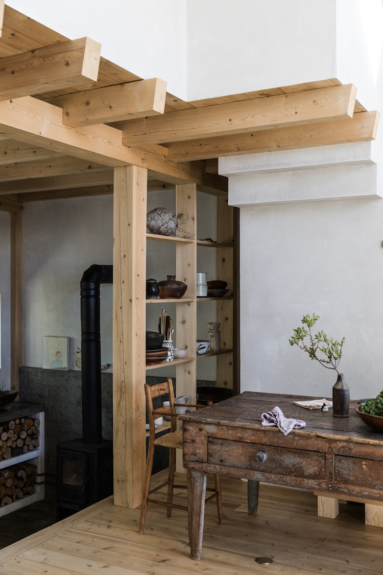
The table (which was picked up at a local secondhand shop) is so beautiful, don't you think? My Mother has a similar one which she bought at auction years ago- sadly the drawers mean that it's too low to fit a chair / your legs under the table (just a word of warning to measure up before you acquire one of these bad boys!). She uses hers as a side table, and it looks equally beautiful!

I love how the textures - such as stone and wood - have been carefully selected to mirror the craggy surrounding landscape.


A small stove resting on a vintage chest-of-drawers serves as somewhere to cook evening meals (in a back-to-basics kinda way!).


Rails made from copper pipes and ropes are used as clothes hangers in the bedroom.

Wow! So striking, personal and unique! You can really sense the connection that the house has with its surroundings.

The interior would look equally at home on the rugged Swedish Baltic island of Gotland.

And the exterior reminds me a lot of this incredible black house by the sea in rural Iceland which I'm totally planning on renting one day! 

Are you a fan of black facades too?  

Niki

Photography Greta Rybus, found via Remodelista with thanks. 

Twitter FaceBook

Pin It
4

A Charming & Relaxed Swedish Home In Blue And White

Hejsan! It's one of those weeks where I'm constantly on the back foot - anyone else experiencing that? I'd never leave you high and dry without some beautiful interior inspiration though - besides this lovely Swedish space has been the highlight of my day! The blue and white colour scheme and relaxed nature of the space caught my eye. There's also a load to love - including the mix and match furniture, books, plants and art  which give the place in Kungsladugård, Gothenburg it's soul! I hope you feel as inspired as I do by this lovely home! 

It's so hard to find lovely old tables - but a close-up of this one reveals it's been handmade (possibly using IKEA legs and a door or other reclaimed item). So clever - and actually not that difficult to cobble together if you fancy doing something similar. 


The sitting room reminds me a little of the beautiful Varberg home of Kristin Lagerkvist 8(you can see a glimpse of her living room here). 


There are a few lovely things at play in the space above - including a wooden cabinet which has been painted in the same colour as the wall, Elfa shelves lined with books and other treasures and a simple grey sheepskin* draped over a mid-century chair - all of which make it feel personal and cosy!


So charming, don't you think?

Is there anything that stood out to you?

I'm still thinking about the Elfa book shelves (not just in the sitting room, but also in the hallway) - and wondering where I might be able to fit more shelving in my own home (so many books, such little time... and space!).

The blue and white theme has me thinking about the subtle coastal tones in this danish cottage, a striking blue and white Swedish home full of contrast and the details in this striking Danish house. Blue will always be one of my favourite shades - are you a fan too?

Right, better get on, so much to do! Eeeek!

Niki

Photography courtesy of Kvarteret Mäkleri

Twitter FaceBook

Pin It
5

Subscribe To My Scandinavian Home

Subscribe to My Scandinavian Home

skovby ad


site by ANAAR

This website uses cookies to ensure you get the best experience on our website.
MORE INFO