Scrolling

Before & After: An Outdated Property Becomes a Vintage-inspired Family Home

Men Tjeeena! Hur är läget? Today I'm taking you on a virtual trip to Trier in Southwest Germany and Esther Soellner's wonderful home. When Esther and her family first discovered the1903 listed building it had a distinct look of the 1970s - all the rooms had panelled wood and suspended ceilings. Sadly, the stucco and original floor had been destroyed and it lacked many of the other original features. Esther, an interior architect, was keen to restore the house and bring it back to its former glory. her and her husband set about opening up the rooms and reinstalling original features such as doors and windows. The living space was then furnished furniture from antique markets across Europe including France, Belgium, Netherlands and Italy - as well as handmade pieces. The result is a calm home with a vintage industrial vibe and a hint of poetry.  Here are some before and after snapshots: 

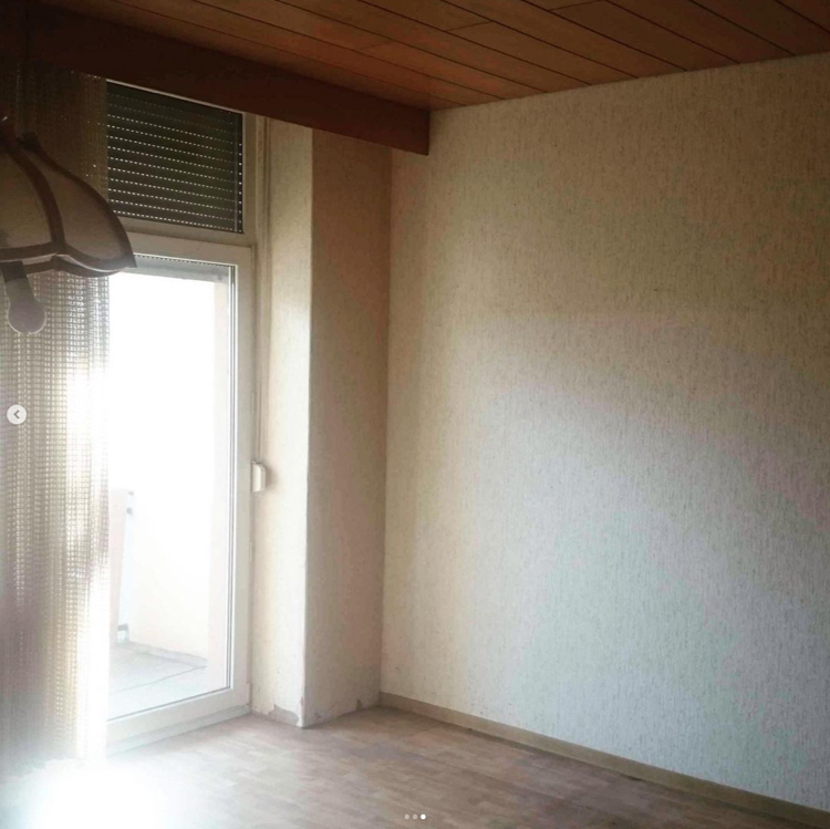
Kitchen /dining area before

The extent of the renovation was absolutely enormous and included completely gutting the space, tearing down a wall and putting in new windows. 

On the opposite side of the kitchen / dining area, the suspended wood ceiling was removed and new windows and doors were put in. 

Dining area after: 

The cabinet is a fine example of one of Esther's many antique finds. So beautiful! 

Upstairs landing before

You can really see just how dilapidated the house was when the family first found it. Simply everything needed revamping. 

Upstairs landing after

The original wood floor was sanded down and given a new lease of life with white paint, while a mid-grey emphasises the architraves, turning it into a feature. 

The children's bedroom has been kitted out entirely with vintage and antique pieces.

Master bedroom before


Master bedroom after
Esther made use of existing plumbing to add a luxurious feel to the bedroom with a bath (I'm just imagining a candlelit bubble bath and a great book before bedtime!). She also made a feature of existing beams and pillars - stripping back the plaster to reveal the original brickwork. 

A vintage industrial JIELD lamp (I've got one of these in the corner of our sitting room too - always been a fan!)

A black and white theme in the bathroom (love the traditional style loo!) is softened with vintage touches included a wall cabinet and hooks. 


How beautiful! 

I love all the historical doors and internal windows - as well as the general simplicity of the space. It really allows the architecture to shine. 

Keep an eye on Esther's instagram feed @esma.auguste for more snapshots from her lovely home. 

I love a before and after - do you? Here are a few others to enjoy this Lillöradag (little Saturday): 


Har det bra! 

Niki

Photography courtesy of @esma.auguste

A Serene White Swedish Home with Warm Touches of Wood

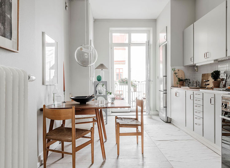
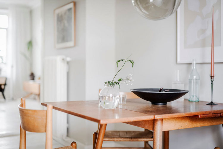
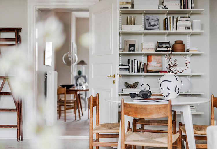
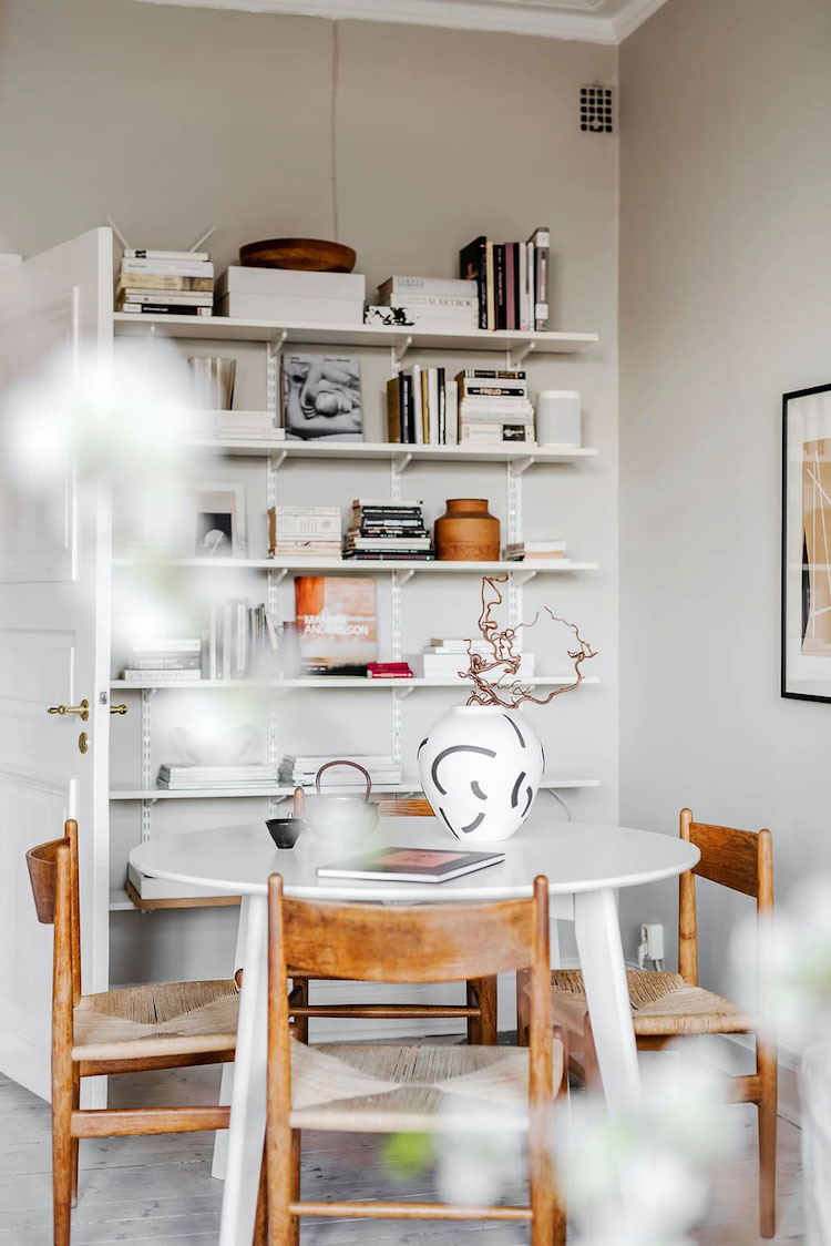
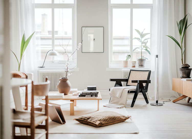
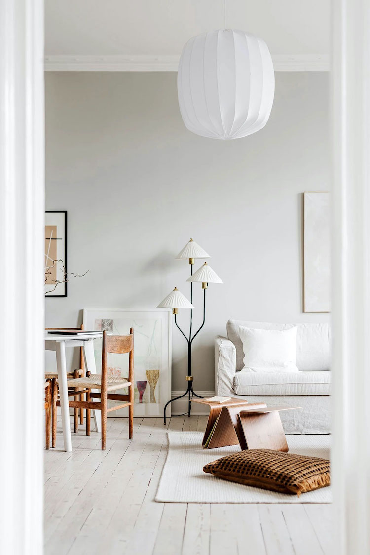
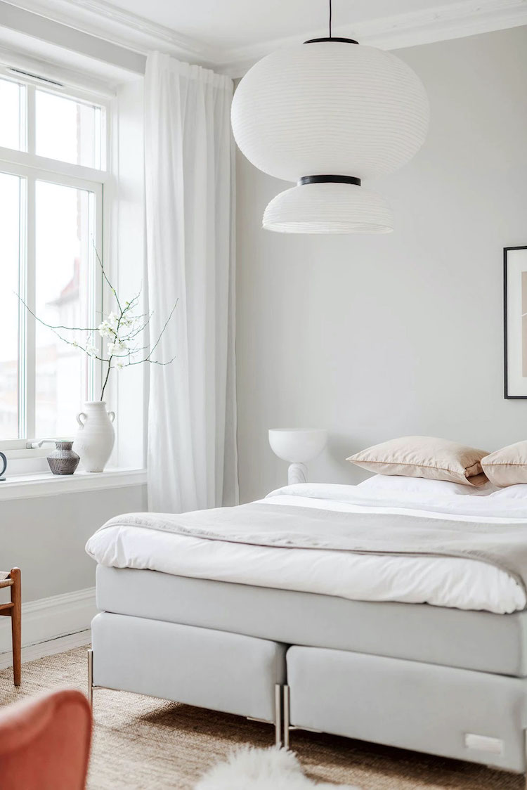
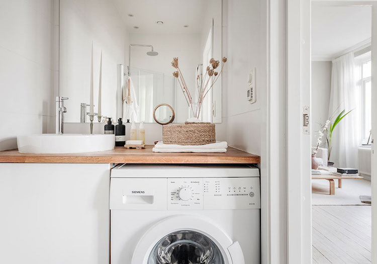
Come here for a breather today? You're in the right place! Decorated by Grey Deco in nuances of white and furnished with pieces in an array of natural material like wood, cane and linen, the living space is a total breath of fresh air and a wonderful oasis in the heart of Gothenburg. Although styled for sale, I can totally imagine stepping inside and filling it with my own personal touches, how about you? 

Note how the washing machine is in the bathroom. In Sweden this is very common in apartments. It's either that or a communal 'tvättstuga' (laundry room), where you book a time slot (the subject of numerous exasperated conversations - everyone has a 'tvättstuga' story - usually a note that has been left by another irate user! 

In the UK, washing machines tend to be in the kitchen (if you don't have a separate laundry room or mudroom). 

Where does the laundry tend to happen in your country? 

On a separate note, the subtle nuances in this apartment are so lovely. My guess is that they've used something like 'Classic white' on the ceiling (NCS S0500-N) and then Jotun Tidlös on the sitting room and bedroom wall.

Wishing you all a serene day!

Niki

PS I am so excited about the before and after home tour I have lined up for tomorrow - it's full of vintage finds! See you then! 

Twitter FaceBook

Pin It
21

The Handmade Home of a Danish Architect and Carpenter

Yesterday I was wondering around a DIY (Do-It-Yourself) store in search of a tool and I found myself mulling over how good Scandinavians tend to be at fixing things around the home - and how this has inspired me over the years. The truth is, a lot of things that require attention are relatively simple to fix - and it can feel really empowering to get out a tool box - saving yourself time and money in the process. 

But architect Mette Kirk (@kirkarkitektur)and her husband Henrik Balle - a carpenter at Silkeborg Byg go design, have taken DIY to a whole new level. The talented pair have renovated their 1935 house in Aarhus entirely by themselves - even creating the kitchen cabinets, bathroom storage and other units from scratch. Ready to feel inspired? 

The entirely unique kitchen cabinets in white and wood were designed by Mette to capitalise on space.

Wall units like this wooden one designed by Mette and built by Henrik have become increasingly popular in Denmark lately. My Copenhagen-based friend Caroline Bahrenscheer recently launched a beautiful version for cups, available here

The dining space is filled with fab Danish design pieces including wishbone chairs, BT001 pendant lamp, and a Formikami table lamp.

A beautiful parquet floor from Hørning Parket has been laid throughout the house. 

This style of built-in cabinetry (made by Henrik) is ideal for small bedrooms as it makes use of every inch.

I love the built-in bedside table nook - such a clever addition! The lamp is the Louis Poulsen Ring Crown.

Henrik also built the wooden bathroom cabinets (look at the detail!) - which add a wonderful warmth to the space as well as gallons of open and closed storage space! The loo is from Ifö and the floor was found at Flisegalleriet

What an inspiring home. 

It would be so useful to be able to whip up incredible cabinets and storage units at whim, don't you think? And of course, Mette's eye for design is simply wonderful too! 

Do you have enough storage in your home, or has Mette and Henrik's house inspired you to add more? 

Perhaps more importantly, how much do DIY do you do? Are you the type to get out a toolbox if something needs fixing or do you prefer to call a handyman? I've learnt to dabble (although Per does the majority!) - but we're on nowhere near the level of building incredible units like the ones in this home!

Would you like to feel inspired by other architect's homes today? Here are some lovely ones: 


Have a great start to the week friends!

Niki

Photography: Mette Kirk, shared with kind permission

Twitter FaceBook

Pin It
2

Cabin Update: Wood Burning Stove (Plus Try the Tool!)

Disclosure: Contura have kindly agreed to partner on our cabin project

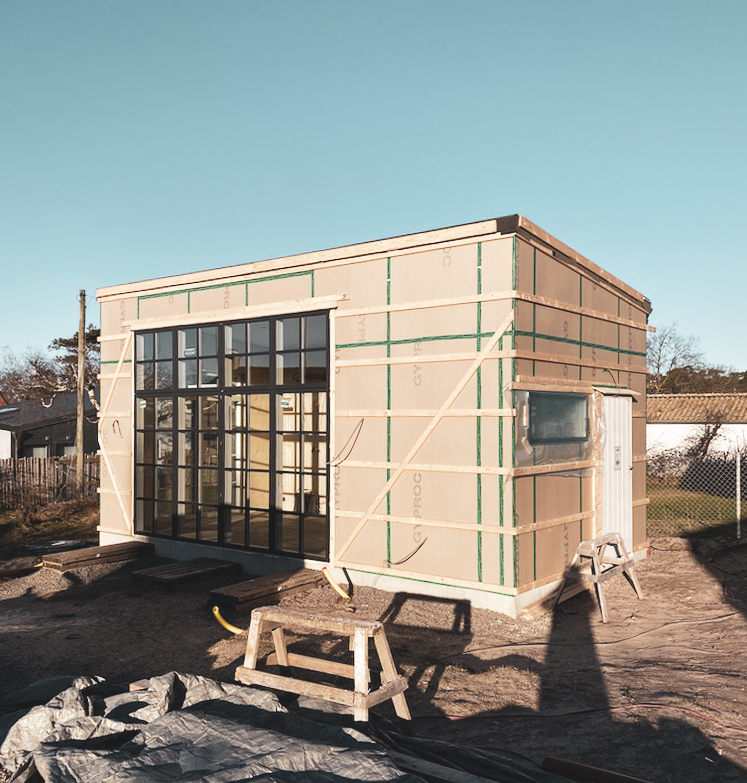
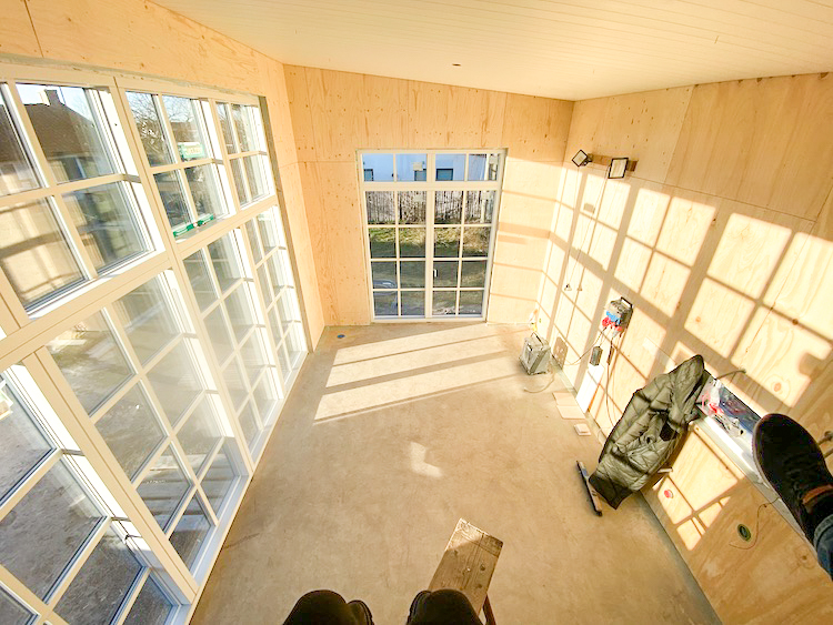
Over the Christmas holidays, so much more happened than playing about in the snow and drinking glögg: our little cabin sprang to life (see the design plans here)! I'd love to say that the picture above is of the interior - but we're far from finished! The good news is though, the structure is in place:


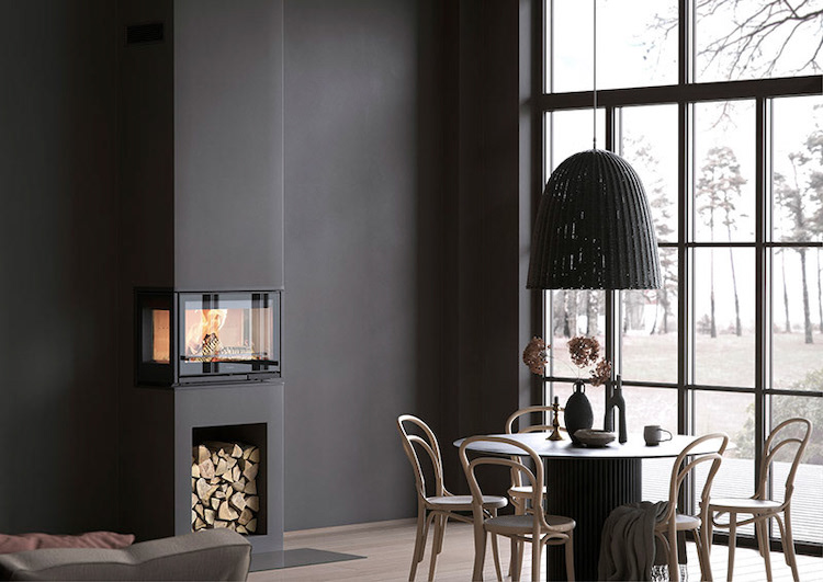
So exciting! With all the bigger aspects decided including the wood panelling, windows and doors and the bathroom, it's time to decide on a wood burning stove. I LOVE a fireplace, do you? To me, they are pure hygge and I couldn't imagine our little cabin without one! 

Which one?
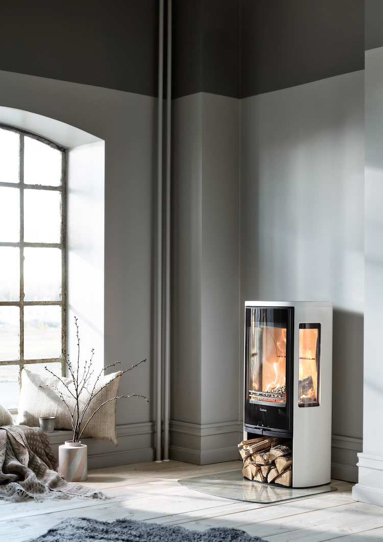
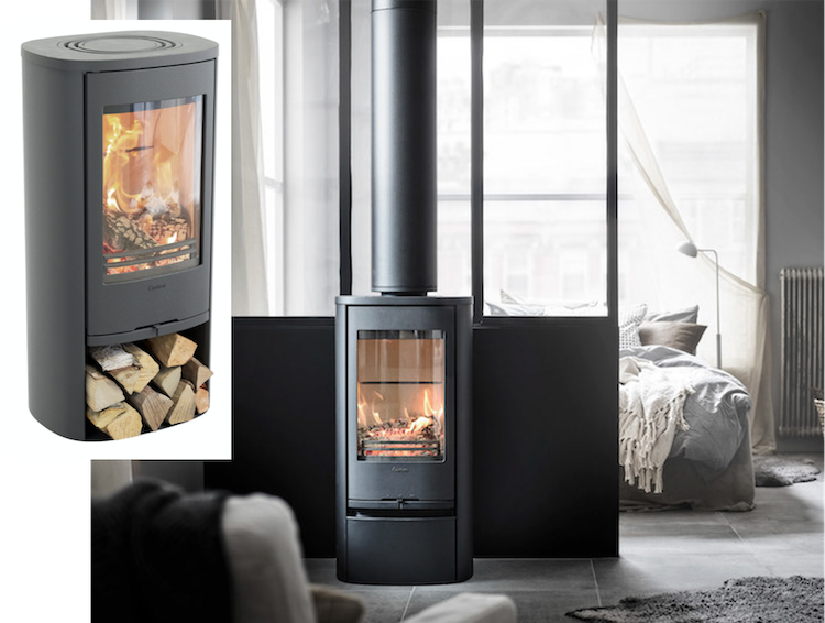
I knew I wanted to get one from Contura. The Swedish brand is located only an hour from the cabin and recognised as the leading manufacturer of woodburning stoves in Scandinavia as well as a big player across Europe (AKA the guys delivering the hygge!). I've heard many a great things about their Swedish-made log burners when it comes to quality and efficiency, and I love the design!  


Choosing a stove using the virtual tool
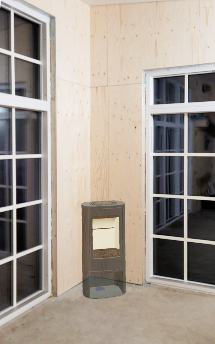
Anyone who's been in the market for a wood burning stove will know there are so many out there to choose from, it's almost overwhelming! Keep a look out for a stove that works for the size and design of space you have. Plus, I found the Contura 'build your stove' tool super handy! It allows you to build your own stove and then virtually place it in your home to see how it looks! Hours of fun! 

Admittedly, I got a bit carried away and Per was very nervous when I revealed pictures of how one might look in our bedroom, sitting room and bathroom at home! 

To use it, just head over to Contura and click on ' build your stove' (top right orange button) and follow the simple step by step instructions. 


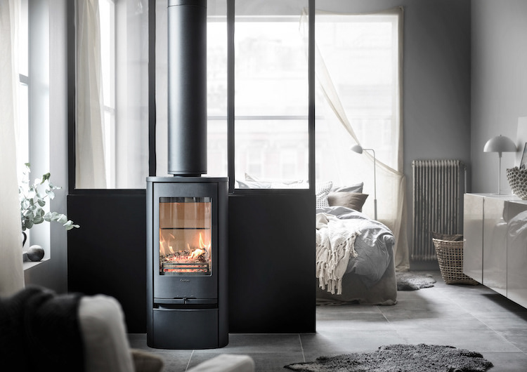
In the end I decided on the Wood burning stove Contura 810 in black steel with built-in wood storage for our cabin, which I think is super sleek and great for space-saving. 


Positioning

Above is a snapshot from inside our cabin right now (taken from the loft bed ). We plan to place the wood burning stove in the far left corner. This is how it will look - except a little larger in size and with a chimney:

I think it's going to be great and feeling so excited now. Here's to cosy days at the cabin! 

Just need the panelling to go in and get the bathroom and kitchen fitted, the floors laid..... gaaah so much to do! 

Do you have a fireplace in your home? Or perhaps you've been considering one (try the tool if so!)? Please do share your experiences below! 

Wishing you all a hyggeligt weekend!

Niki

Twitter FaceBook

Pin It
5

How a Vintage Cigar Cabinet Became Perfect Home Storage


I was so intrigued by the incredible vintage cabinet in Jana Roach's home yesterday that I had to dig deeper. Where did they find it? And most importantly, how did they manage to find the exact size piece required for the space? Read on to discover that not all is always as it seems... and sometimes it takes a whole load of imagination and some hard work to make the vintage piece you fall in love with fit your home! 

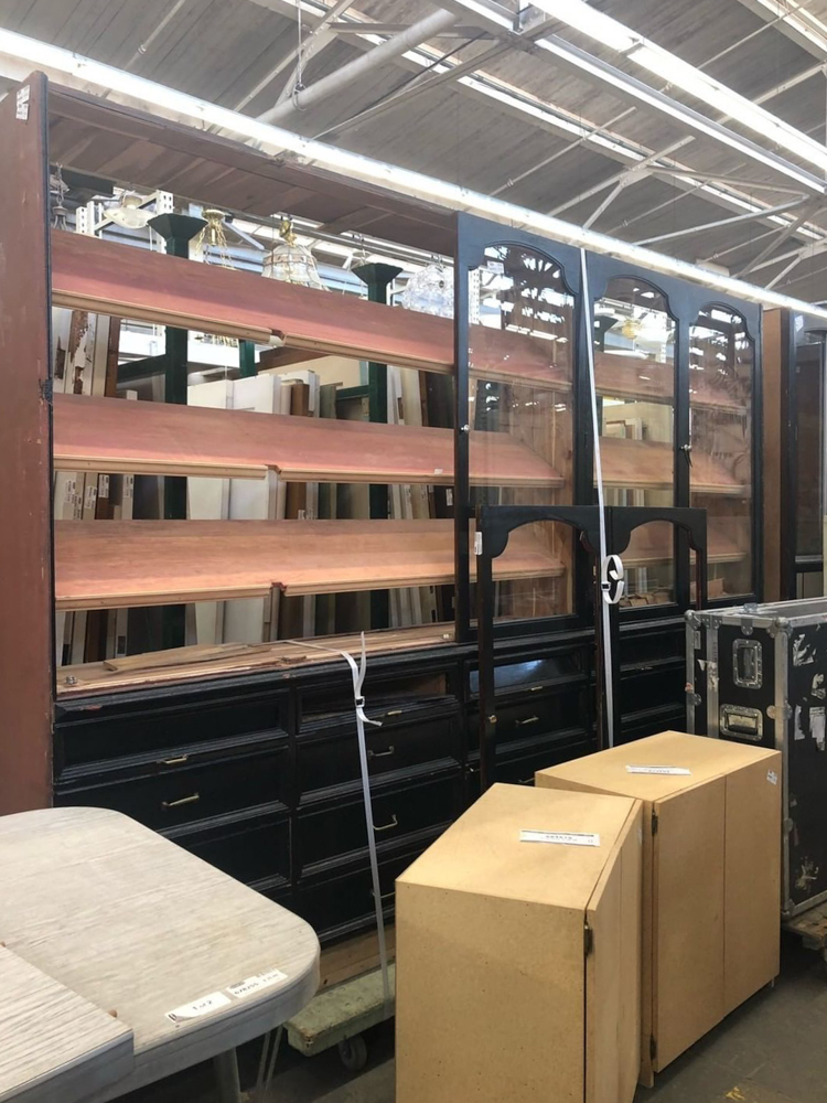
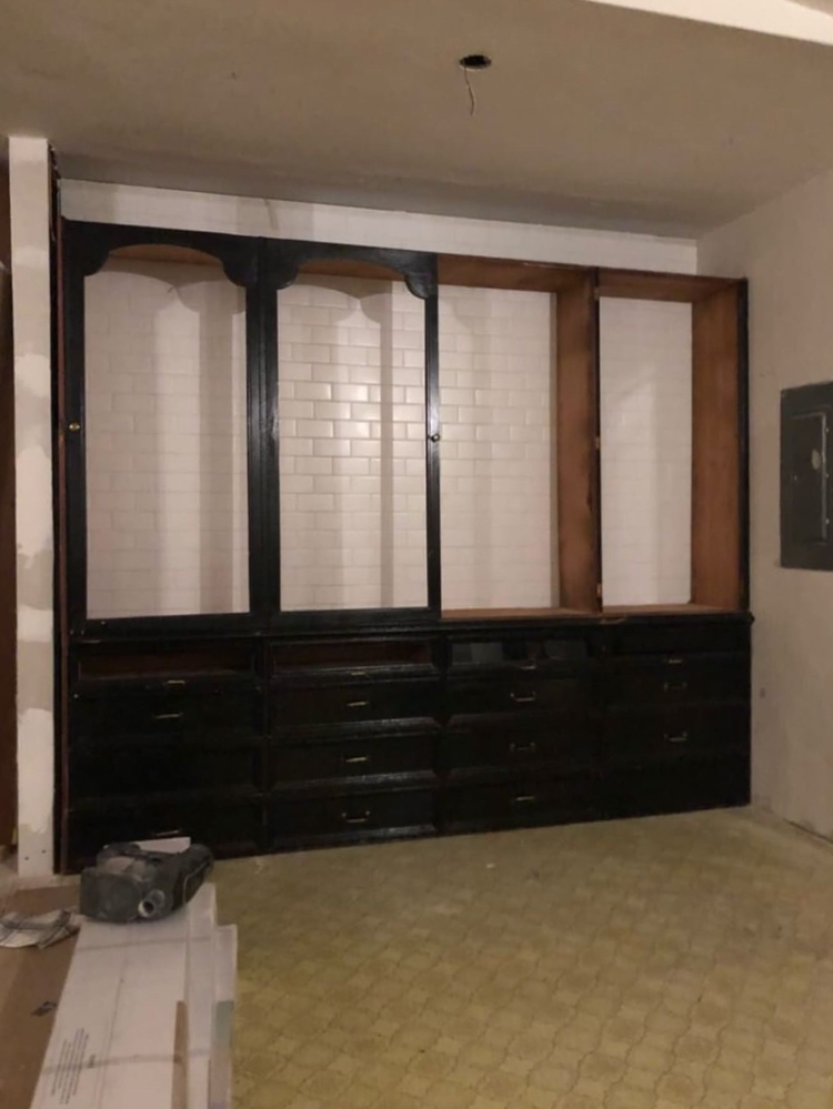
The original piece: 
Jana and her husband Tanner were in a second-hand building materials store in Seattle, US in March 2019 when they came across this old cigar display. 

They immediately fell in love with it, but the unit was way too big for the space they had - plus the slanted shelves (originally used for displaying cigars) were far from practical for kitchen storage. 

Many would have been deterred, admired its beauty and walked on. But not Tanner and Jana

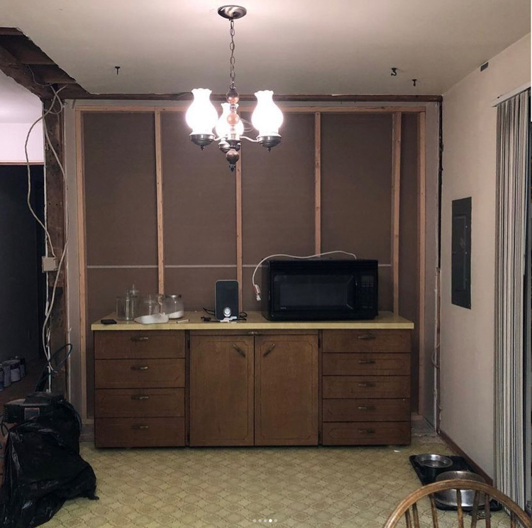
The space
They could see its potential as a cabinet for their new dining room. The unit and the space just needed some work! 

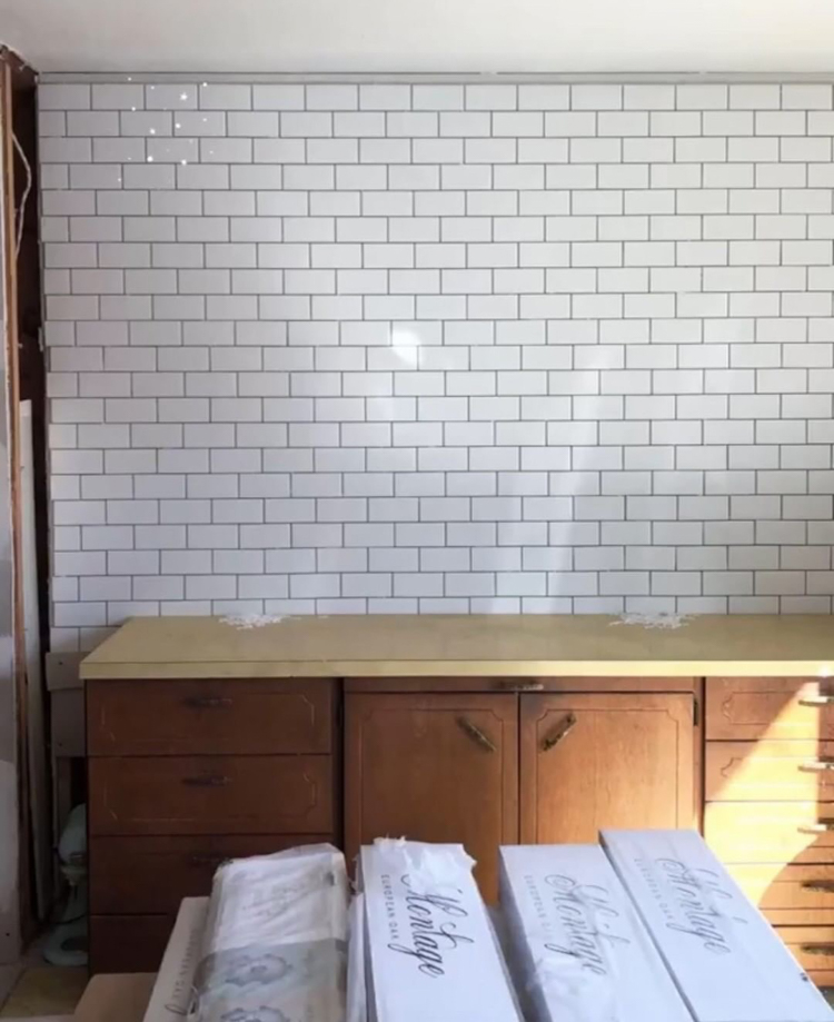
What they did
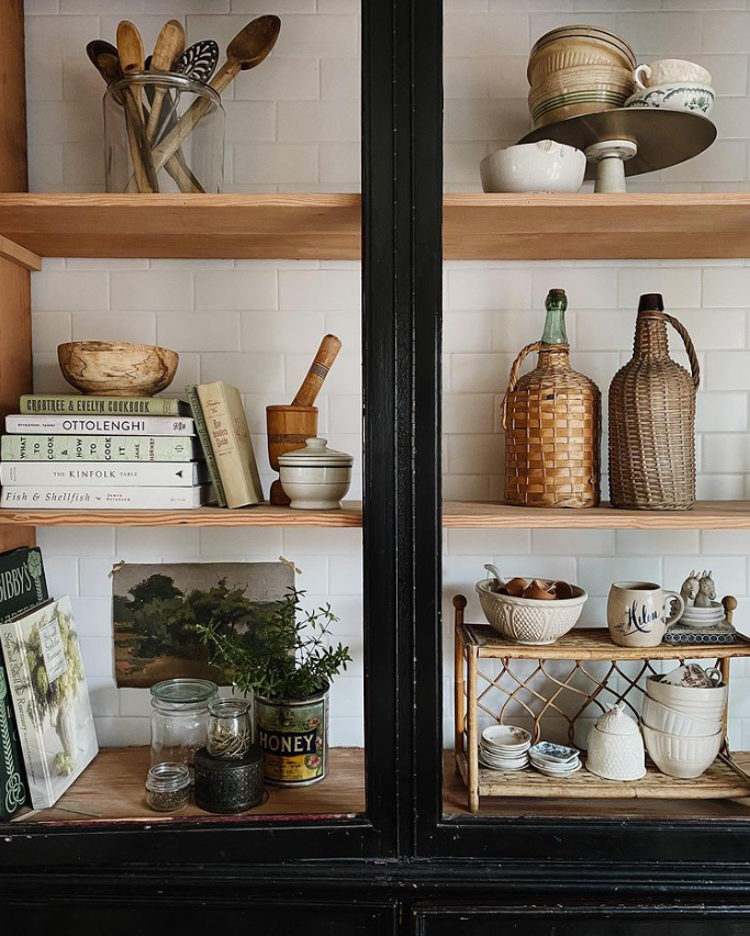
Since the cabinet had no back, they prepped the back wall with white subway tiles. They opted for white grouting so that it wouldn't take over from the items in the cabinet. 

The cabinet was then modified to fit the space. This meant cutting off one of the bays, raising it by around 6 inches and adding a crown trim, base and side. The shelves were also levelled. 

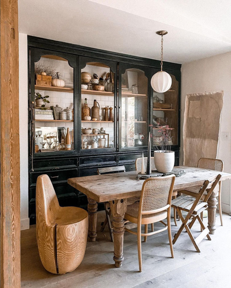
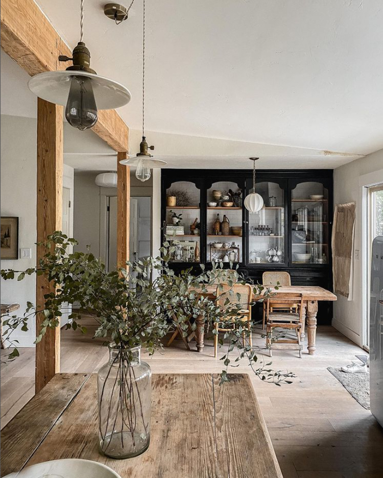
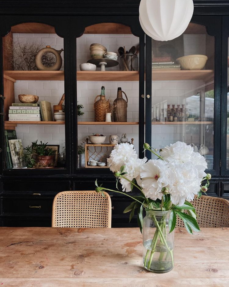
The result:


I love this transformation! 

Looking at some of these homes, it can appear that everything has just effortlessly fallen into place, but it's not always the case - often there's a whole level of imagination and hard graft involved! 

Jana always recommends taking a tape measure to flea markets and reclaim yards. You never know - you might just stumble across a piece you love, and even if it's not quite right in terms of size or colour you might just be able to adapt it for your home and give it an entirely new lease of life anyway! 

Have you up cycled / renovated any second-hand pieces in your home? If so, I'd love to hear about them! 

Niki

PS I don't usually publish posts on Friday, but tomorrow will be an exception - and it's dedicated to anyone who has been wondering whether or not to install a woodturning stove! 

Photos courtesy of Jana Roach, shared with kind permission.

Twitter FaceBook

Pin It
2

Subscribe To My Scandinavian Home

Subscribe to My Scandinavian Home

skovby ad


site by ANAAR

This website uses cookies to ensure you get the best experience on our website.
MORE INFO