Scrolling

A Swedish Home with Warm, Golden Tones

Friday already? How great is that? I'm celebrating by working away in a little cafe by the sea beside my house. It's a little foggy though so the Öresund bridge (which connects Sweden and Denmark) is shrouded in cloud). In this Gothenburg apartment though, it looks like the sun is always shining thanks to the warm golden tones. Would you like to take a look around and get some lovely ideas? Follow along for the tour. 

I often talk about a 'red thread' - which is a Swedish phrase for carrying a theme from one room to the next  to create a cohesive look and create harmony. In this space the same beige-yellow hue has been used in some shape or form in every room. 

Note above how a shelf has been placed over the door making use of 'dead space' and also drawing the eye upwards to make full use of the magnificent ceiling height. 

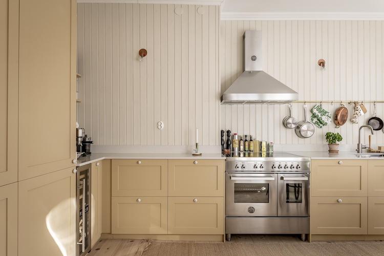
I mentioned in Wednesday's post that range ovens are making a big comeback in Sweden lately. Don't get me wrong, in-built ovens are still more prevalent, but these beauties are sneaking into older homes and adding a wonderful focal point to the kitchen. In Sweden we don't use so much gas, so if you look closely, you'll notice that these are often induction. 

Doing away with upper cabinets for a cleaner look is still a hot trend. Even so, open shelving and rails with hooks help to add a relaxed, cosy touch. 

Note the panelling contains beading which adds a traditional touch to the look (see my panelling style guide for more information). 


Possibly one of the slimmest wine fridges I have seen - so smart if you like to keep your wine at exactly the right temperature but don't have a lot of space to spare! 

An extra dining area has been added in the open-plan sitting room. Note the wall-mounted glass cabinet - a popular feature in Swedish and Danish homes right now! 

All storage in the sitting room is made from the same wood, adding warmth and texture to the space. 

A fully working masonry stove in the corner adds such a cosy touch to the sitting room! 

Whoever has lived here (and soon moving out) is very keen on storage - which is a dream to see! Note how the cabinets do not go the entire way to the ceiling for a contemporary touch (and to not obstruct the beautiful cornicing!). 

I feel warm just looking at this apartment - there's definitely something to be said for yellow-ish tones, don't you think? 

For those of you who think it's helpful to see a floor plan, here it is: 


Right folks, that's it from me this week! 

I'm rushing back home now to help my daughter to pack for her swimming competition in Kungsbacka, on the Swedish west coast this weekend (did you see Lovisa's home which I shared from the same town on Wednesday? So charming!). And tomorrow I'm excited to be heading over that bridge to Copenhagen for the day. Let's hope it isn't still shrouded in fog! I hope you have some sun / relaxing plans too! 

If you'd like to see a little more inspiration over the weekend, check out the Swedish, Danish and Norwegian home archives - there are over 12 years of Scandinavian interiors to explore! 

I'll be back on Monday with a tour of a danish summer cabin with the most beautiful garden (I've been taking notes for our own cabin garden). Hopefully see you then! 

Niki

Photo: Henrik Linden for Alvhem

Twitter FaceBook

Pin It
5

Pantone Colours of 2021: Illuminating Yellow & Grounding Grey:


You know the year is coming to a close when Pantone announces its colour of the year! For 2021 they've taken a slightly different approach with not one but TWO individual, yet complimentary colours.  After the year that 2020 has been, everyone had an inkling that the guys might just opt for a vibrant colour. And they certainly didn't disappoint, listing the first shade as PANTONE 13-0647 or “illuminating yellow” – a bright, optimistic and vivacious tone. The second, is a more muted PANTONE 17-5104 - named "grounding grey". 

"Something that’s been apparent across the board is how much we need each other, that these connections with others have given us strength and fortitude, as well as the hope and the positive outlook that are essential to our moving forward,” Pantone’s spokesperson said. “By choosing two independent colors, that helped us subliminally convey that message.” 

While grey has always held a place in my Scandinavian-design heart, yellow is not a hue I've ever gone for in my own home (despite appreciating it in the homes of others!). However, after a little digging around the net for inspiration, I might just have been swayed. Take a peek at these sunny rooms - you might just fall in love with it too, either way, the colour will certainly put a spring in your step! 


What do you think? Did you find these space uplifting too? 

I think Pantone’s choices are really on the pulse of what's happening around the world right now. And although this is not the first time Pantone has chosen a shade of yellow as their colour of the year, this feels like a very much needed lift to our homes in 2021! 

In case you're feeling inspired to add a drop of golden sun to your home, here's a round-up of 11 vibrant pieces: 

GET THE LOOK

1. Alphabeta Uno pendant
2. Lemon Print
3. Lean lounge chair
4. Restore storage basket*
5. Aalto stool E60
6. Mono blanket wool*
7. C.Lamp
8. Suede oven glove
9. DLM table
10. Hatch Ikat Flatweave Yellow Area Rug
11. Bellhop table lamp


Here's to a brighter 2021!

Niki


PS I'll be stopping by tomorrow for my last post of 2020 and excited to share a few ideas I have for My Scandinavian Home for the upcoming year, I'd love to get your input too! See you then!

PPS Thank you so much to Ana for helping me to compile this post - and for all her wonderful behind the scenes work over the year.

1. Luisa Brimble 2. Farrow and Ball 3. Laure and Joliet 4. Mattias Hamré 5 & 6. Elle Decor - Sean Fennessy 7. Anki Wijnen 8. Cindy Denekamp 9. Studio Rhonda

Twitter FaceBook

Pin It
6

8 Ways To Create Cohesion In Your Home - Danish Style!

Home decorating is such a personal process. And in my mind, the warmest most inviting and unique spaces are usually made up of a wonderful mix of pieces collected over time. But combining furniture and accessories from different eras (and styles) can also make it tricky to achieve a cohesive look. This is where the 'röd tråd' (red thread) comes in. In the world of interiors, the Swedish term röd tråd refers to a theme which connects every room in your home in order to achieve a wonderful, considered, cohesive look. 

The chances are, you already have a röd tråd throughout your home - whether conscious or subconscious. But if you feel your home lacks cohesion, the good news is, it's easier to achieve than you might think! The answer lies in repetition. Pick a theme such as an accent colour (like blue, green, or yellow etc) a material (such as brass, chrome or rattan) or even a shape and repeat it several times in each room throughout your home. It can be as subtle or strong as you like. Allow me to illustrate this using a beautiful danish home (after all, the Danes are masters at this type of thing, right?). 

Dane Kinne Andersen has achieved a wonderful flow throughout her Copenhagen home by connecting each room with a yellow accent. Subtle it may be, but the touches create just the desired effect. I picked out eight props that Kinne has used for a cohesive look: 

1. Brass touches: metallic brass touches help to emphasise the yellow accent colour in every room of Kinne's home

2. Vases (see top picture): a beautiful yellow vase in the kitchen 'visually' binds the space with other rooms in the house. 

Off topic, but can we all take a moment to admire the pink HAY candle in a classic Skultuna Lily candleholder too? I love it when Danish and Swedish design come together!


3. Art: paintings and illustrations that contain your chosen röd tråd (whether that's a colour, shape or material) are great for creating cohesion between rooms. 

4. Furniture: in order to achieve cohesion, your accent colour doesn't need to be the exact same shade - it could be a darker or lighter version. In Kinne's sitting room, an Arctander chair in a yellowish shade as well as a brass magazine rack and vase help to tie the space in with the rest of her home. 


5. Bed linen: Kinne has opted for pale yellow bedding in the master bedroom for a wonderful sunny vibe - and of course, to tie the space in with the rest of her home. These days you can buy bedding in every shade under the sun (try Etsy*) - perfect for adding an accent colour to your boudoir! 

6. Paint: mix up your favourite hue and apply it to a wall, door frame, or in this instance, a chest-of-drawers. 
 
7. Flowers - you're probably drawn to flowers in your favourite colour already, but if not, and you feel your home lacks 'flow', think about the colours of the leaves and petals on the plants and flowers you buy. Here, a pop of yellow from a sunflower adds a vibrant touch to Kinne's nightstand.

8. Towels and robes: bathrooms are such a big investment. So much so, that I've always been loath to go all out with an accent colour (even if I do fantasise about pink tiles!). Call me safe, but a neutral bathroom will stand the test of time and you can still go wild with an accent colour using accessories such as towels and robes, just like Kinne! 


What are your thoughts on this? Do you like the idea of a red thread? Perhaps you already have a theme in your home - in which case I'd love to hear about it. 

Oh, and I couldn't resist adding in a garden shot - simply because the outdoor season has been extended indefinitely this year! Loving the French bistro chair / rattan combo, how about you? 

See more of Kinne's beautiful Østerbro home over on her instagram @kinneandersen

There are also a load more Danish homes in the archive. If you decide to pour a coffee and head off for more inspo, keep an eye out for that röd tråd

Niki

Photography: Kinne Andersen

*affiliated link which means I'll make a teeny amount of money if you click through and buy something (at no extra cost to you). 

Twitter FaceBook

Pin It
6

A Charming Swedish Home With Pops Of Golden

I've just arrived in London for my book launch as well as a very exciting collaboration with new Scandi homeware brand Eërtmug (if you're in town try to get down to the pop-up shop in Shoreditch on Saturday where you can pick up beauties like these - with all proceeds going to Centrepoint!). Miraculously it's going to be beautifully sunny all weekend (how's that for a warm reception?!) and it's the same in Sweden too. Even so - don't you find there's a distinct crispness in the air? Today, I'm taking inspiration from this lovely Swedish home which embraces the fiery colours of autumn. Think  tones of cinnamon, golden brown and mustard yellow mixed with olive green and a hint of yellow.


Credit Fantastic Frank / stylist - Ida Lauga

So cosy!

I love how the autumn sunshine pours in through the double balcony doors. I can just imagine drinking a coffee and reading all day in those warm pools of light!

Is there anything that captures your imagination?

Get the look: Dining - Series 7 chairs. Sitting room -  this bar cart is similar, pick up a mid-century mustard yellow chair here. Bedroom - blue linen duvet cover and pillow cases (I have the same in my bedroom and it's such a cosy colour for this time of the year!).

Other homes with autumn touches include a dreamy estate in Australia, a beautiful Swedish home with beautiful autumn touches, and a lovely small Swedish space.

And that's it from me this week! If you're curious about my London adventures follow along over on Instagram Stories!

I hope you have a wonderful weekend - and see you Monday!

Twitter FaceBook

Pin It
4

A house that invites the sunshine in!

Having experienced twelve long, dark Swedish winters - it's safe to say I've become slightly obsessed with light. As a result, I've done everything possible to draw every last drop of sunlight into my home (lightened the floors, white washed the walls and knocked down walls) and I've even written a book about it! So imagine how excited I was when I discovered the Melbourne home and studio of architect Andrew Maynard, inspired by a wish to need to wear sunglasses indoors?! Told by his doctor that a lack of light could be partially to blame for his work-related stress, Andrew and his partner decided to create a space which would bathe them in 'sunlight' and drench them in 'vitamin D'. And just to be sure it truly captured that 'bright (bright) sunshiney day' feeling, he added splashes of sunny yellow for good measure!


Architecture: Andrew Maynard Architects. Photography: Tess Kelly. Found via Dezeen with thanks.

What a great concept?!

Would you consider doing this in your home? As Andrew readily admits, there are limitations with a design like this - such as letting the sunshine in, in places where there definitely shouldn't sunshine! But the sunny yellow colour and abundance of light ure does put a smile on your face, right?

Look out for the inspiring space-saving ideas and clever solutions too - such as book shelves above doors and shelves built into the stairs - love!

Is there anything that stands out to you?

I just realised it's been absolutely ages since I shared a home with splashes of yellow - I even had to root around to find the archive -if you're in a sunny mood and feel like a little more 'yellow' interior inspiration here it is (if this home comes up first just scroll passed it!).

Oh and before I head off - sorry if I've seen a little rushed this week, I'm in the final stages of a big project and it's been a bit hectic (my family will tell you that's an understatement!) - including a computer crash yesterday (how much do you dread the words - "have you backed-up your hard drive"?!). But do you know what? It's all cool.... and it's friday people, FRIDAY - woohoo! I hope you've got some great things planned?

Have a lovely sunny weekend!

Twitter FaceBook

Pin It
14

Subscribe To My Scandinavian Home

Subscribe to My Scandinavian Home

skovby ad


site by ANAAR

This website uses cookies to ensure you get the best experience on our website.
MORE INFO