Scrolling

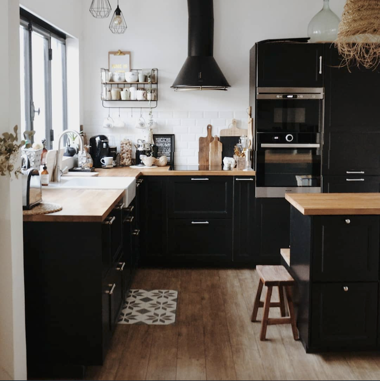
A Home In The South of France With a Lovely Black Kitchen


Black kitchens are on my mind after chatting to Desirée of Vosgesparis over the past few days (she's currently renovating a kitchen too so we had a lot to talk about!). We're in Transylvania for a few days on a blogger trip and today we're off to Dracula's castle! Mwah ha ha haaaa. Anyway, where was I? Ah yes, black kitchens. They are not for everyone but if you have the courage to go dark, you'll be rewarded with a dramatic space that makes a wonderful statement. This warm kitchen belongs to Camille - a deco coach, online shop owner and the blogger behind Cosy Home - her husband and two little boys, Jules and Noah. The family live in a pretty little village near Aix en Provence in the South of France and their home is full of vintage and artisanal pieces from the region, art, warm wood as well as lots of plants and dried flowers. I couldn't resist sneaking in a few pictures of their open-plan dining room and sitting room too (you'll totally see why!).


Such a lovely family space, don't you think? I'd be happy to hang out here over a fika or two, how about you?! 

You can see more of Camille's home on instagram and her blog

Tempted by a black kitchen? Try IKEA (made from recycled plastic bottles), Reform (one of my latest favourites) and VIPP.

Right, I'd better head off, I've got an important 'Count' to visit. I'm so glad I had all that garlic at the Italian restaurant last night! 

If you'd like to see a few pics from Transylvania they're all on my instagram stories right now - it's mesmerisingly beautiful here. Have you been to this part of the world?

Niki

PS I apologise for any spelling / grammar errors - I'm writing from the back of a very bumpy mini bus!

Photography: Camille / Cosy Home

Twitter FaceBook

Pin It
4

My Summer Cottage Kitchen Renovation: Choosing the Appliances!

In paid partnership with Bosch:
Thank you so much for all your positive feedback on the summer cottage kitchen renovation plans I shared with you last week. I'm starting to feel so excited now! There's just one thing left to do before we rip everything out: choose the appliances. We knew early on that we'd go for Bosch since we've had their white goods for years and they're a perfect fit with IKEA kitchens - but now I realise that's only the beginning. There are other decisions to make. Like, do I go integrated or visible? And which model? Guh! I paid a visit to Elgiganten here in Malmö a few weeks ago to take a look at the options and I've finally narrowed it down to this: 

FRIDGE FREEZER
To be seen or not to be seen - that's the question! At home our fridge is on display but at the cottage I'm thinking that it's since it's a small space, it would be nice to go for a cleaner finish by hiding it behind the cabinet doors (inspired by the image below). 

After a little deliberation I've gone for this streamlined model which is designed to be hidden behind cabinet fronts. Apart from the fact that it would more than cater for our summer wine and cheese (which is our No.1 priority, of course!) it also has a low energy consumption (A++), saving 25% compared to fridge/freezers with energy class A. Nice! It also features NoFrost technology, so we'll never need to defrost it (our kids seem to be incapable of closing a door so it usually looks like the arctic in our freezer) which leaves more time to enjoy... well, the wine and cheese! 

OVEN
We have a built-in oven at home (seen below - note: this is an older Bosch model which is no longer sold) and I love that they take up less space than a range cooker and you can fit more storage around them as a result. Vital in a teeny space! 

Since the oven will be on show, the design is important, and to me, this is the sleekest one in the range! Admittedly, I'm unlikely to appear on MasterChef anytime soon, but I do love to make a Sunday roast (you can take a girl out of England....) so, naturally I love that this comes with a built-in meat probe known as 'PerfectRoast'. All you need to do is insert the thermometer and enter the desired temperature. The oven will let you know when your food is ready and turn off the heat! No more overcooked roasts (can you hear my family breathe a sigh of relief?!). I'm also liking the self-cleaning function which turns all the dirt to ashes, so you never need to clean the oven by hand. Amen to that! 
HOB
Our current cottage stove has seen better days (understatement!) so anything will be an improvement. But since we only plan on updating our kitchen every 50 years (the last time it was 'done up' was in the 1970s) we might as well go state-of-the-art with an induction cooktop. Plus, induction hobs look so neat and. are really easy to clean - as exhibited in the beautiful Danish kitchen below! 

As soon as I saw this one, I felt super excited! Not only does it have a FlexInduction feature which, I learned, means you can use it like a conventional induction cooktop (4 rings) or combine them to make two large, continuous cooking zones - which is awesome for feeding larger crowds. It also has a 'FryingSensor Plus' which essentially means we can fry our food to perfection (cue no more over cooked and under cooked meatballs in the same serving = very happy kids!). It also has a string of other benefits which you can read about here.  

I love a visible fan as much as the next person but once again, we need the cabinet space (minimalists we are not). So instead, we're going for a hood that's practically invisible when not in use, and once pulled out it has the most amazing capacity to clear out the kitchen fast and it's super quiet (if I still manage to burn something with my new oven and hob - no one will ever need know!). What's not to love?!

DISHWASHER
There may or may not be a dishwasher lurking behind the beautiful cabinets in Anna Pirkola's Finnish kitchen, but that's just how I like it! So, for this appliance, I'm going all in 'invisible'. 

We were actually tempted to go for a 45cm dishwasher until a friend pointed out that we'd spend our entire time unloading and reloading it (especially as the kids seem to go through 25 glasses an hour in the summer - do you find the same?!). Which brings me to my next point. And no, unfortunately it doesn't put everything back into the cupboards for us, although that would be amazing! But it is super efficient. The VarioSpeed Plus option rinses three times faster. So, if we've got a back-log of glasses (likely), we can reduce the rinse time by up to 66% at the push of a button. Ha! You won't beat us kids! 
So, that's where I'm at. 

I'd love to hear your thoughts on my choices and please do share your own experiences, I'd love to hear any tips you might have. 

It really does feel like we can actually start tearing out the existing kitchen any day now - woohoooo! Let the fun begin! 

Niki

Photography credits: 1. Niki Brantmark / My Scandinavian Home 2. Photography: Osman Tahir, Stylist and Home owner: Catrine Åberg / Cooee Design   3. Bosch Home 4. Niki Brantmark / My Scandinavian Home 5. Bosch Home 6. Our Food Stories 7 & 8 Bosch Home 9. Anna Pirkola 10. Bosch Home

*This series is in paid collaboration with Bosch. However, all words and pictures are my own and I only ever work with brands I love and think you will too.

Twitter FaceBook

Pin It
10

My Summer Cottage Kitchen Renovation: Floorplan and Design


In paid partnership with Bosch
Quite a lot has happened in the last three weeks with the summer cottage kitchen renovation. I have spent the last couple of weeks measuring and sketching and now I think I may have arrived at a design direction - hurrah! Thank you so much for all your input - it's been invaluable! As you know, our little cottage is located in a small fishing village on the West coast of Sweden. The sea is a gentle grey-blue and I'm keen for the kitchen to reflect this. I'm therefore thinking about a soft, muted light grey or pale green palette blended with white and warm wood.

CABINETS
I've narrowed my search down to IKEA VEDDINGE cabinets (seen in the picture above) since I like the sleekness  - they feel less fussy for a small space and easy to clean 8as one of you pointed out on Facebook - thank you!).

As with any room that employs light colours and a clean look, I'm aware I'll need to add plenty of warm touches. I'm thinking accents of natural wood (hooks, chopping boards, stool etc), stone and tarnished brass.

MOODBOARD


FLOOPLAN
I took my scribbled measurements and pictures of our L shaped kitchen along to the IKEA kitchen design centre (you just book online and then rock up at the given time slot) - and lo and behold the designer happened to be an old friend I hung out with when I was on maternity leave (Jess) - who also happens to have great taste! Malmö's a small place and sometimes it totally pays off! This is the floor plan we arrived at:

CABINET POSITIONING
I would love to do away with the upper cabinets for a really fresh, up-to-date look - but the kitchen is way too small and we have way too much stuff (even after a Marie Kondo style declutter!). Sadly, I'm not sure a lot of open shelving is an option either since we are not at the cottage enough and the items would just collect dust - what do you think? I've left wall space to the right of the sink just in case!
All of the lower cabinets are drawers since they can be fully extended which makes them a more practical option than cupboards.

APPLIANCES
One of the beauties of selecting an IKEA kitchen is that Bosch appliances are a seamless fit (I am keen to use these in the cottage kitchen as we've always had them at home and I'm a firm believer in opting for reliable, good quality appliances that last). The oven and induction hob will be placed under an integrated fan (I love 'open' fans' but need to capitalise on storage). The dishwasher will be seamlessly hidden behind 'number 6' in the layout and the fridge-freezer will be built-in behind the cabinet door in position 11.


I hope you like these ideas. The plan is only preliminary so please do weigh in if you have any thoughts / advice - I'm all ears!
Even though there's a whole load of work ahead, this renovation is starting to feel real now and I'm getting SO excited. Weeeeee! 

Niki

Photography credit for main picture: Mikael Lundblad

*This series is in paid collaboration with Bosch. However, all words and pictures are my own and I only ever work with brands I love and think you will too. 

Twitter FaceBook

Pin It
20

My Kitchen Renovation: 5 Kitchen Colours I love Right Now

In paid collaboration with Bosch 
Last week I mentioned that we're finally renovating our summer cottage kitchen - woohoo! I'm so excited. Not only is it well overdue (see the before pictures here) - it also means a lot of time drooling over swoon worthy kitchens on Pinterest. I've narrowed it down to five looks I love right now (not all practical, I must say, but a girl can dream, right?!). 

1. Blue / grey tones (above) This kitchen belongs to my friend Tina Lekeberg, who's a bit of a colour guru! I love the muted blue, green and grey tones she's used (the darker cabinets have been painted in NCS 6010-R90B and the lighter ones in Restful Le Havre). I'm also a big fan of the light grey marble worktop and backsplash (I've honestly lived with wood worktops for too long and I'm looking for something a little more practical this time round). I also like how the plants add an immediate sense of harmony! 

2. Sage green: This is definitely one of the big kitchen colours of 2019, and there's something so calming about it! Light green is certainly a strong contender for the cottage kitchen (I'll take a couple of samples up with me next time I go).  Are you a fan too? And just look at those little porcelain wall lights! They're from a local shop here in Malmö - and I've had my eye on them for so long.


3. In the pink: How fabulous is the colour of this Reform kitchen from?! As I said a girl can dream - but in reality, our cottage kitchen hasn't been decorated since the 1970s and probably won't get another facelift for fifty years - unfortunately this means I'm kind of going to have to reign it in a little in terms of colour and go for something a little more timeless, do you agree? Don't even get me started on the fabulous tiles!!


4. Two tone: Will you look at this Norwegian kitchen?! The interior architect has used a deeper blue-green on the lower cabinets and a lighter mint-green/blue on the upper cabinets. I also have my eye on the brass / gold touches (are you a silver or gold person?). Since the summer cottage is quite old, I might try to go ever so slightly more traditional with tarnished gold, we'll see!

5. Soft grey: Which leads me to the final kitchen. These soft grey cabinets and brass knobs in the home of Cille Grut were captured for my second book The Scandinavian Home (I'll never forget the day we spent photographing her beautiful house on the Danish coast). The light wood worktop adds a warm touch to the space so if I were to go down this route, I should definitely think about incorporating wood somewhere to prevent the look from appearing cold. What do you think?


IKEA LERHYTTAN cabinets are similar to the ones in the kitchen above. I think they could be perfect for a small kitchen as they are fairly understated and don't take up too much 'visual space'. Also, Bosch appliances fit seamlessly with these IKEA cabinets (I'm very keen to integrate the dishwasherovenfanfridge etc.) so this could be spot on! Hmmmm. Lots to think about! 

Next step: measuring-up and designing the layout. Oh, and testing those colour samples I mentioned. It suddenly feels like there's so much to do! 

I'm looking forward to updating you with my progress next week. In the meantime, please do weigh in below, I'd love to hear your thoughts! 

Niki

Picture credits: 1. Niki Brantmark / Tina Lekeberg 2. Photography Petra Bindell, Styling Emma Persson Lagerberg. 3. Reform 4. Photographer Nicklas Hart, Interior Architect Cecilie Claussen 
5. The Scandinavian Home published by CICO Books. Photography by James Gardiner © CICO Books 

*This series is in paid collaboration with Bosch. However, all words and pictures are my own and I only ever work with brands I love and think you will too. 

Twitter FaceBook

Pin It
10

My Swedish Summer Cottage Kitchen Renovation (Before)


In paid collaboration with Bosch
I am so excited to introduce a new series today. If you've been following My Scandinavian Home for a while, you'll likely know my family and I have a very small summer cottage on the West coast of Sweden. I've never actually showed pictures of it before because it's in major need of renovation. I mean MAJOR! But all that is going to change! Over the next twelve weeks I'm going to be renovating the kitchen. I know in these pictures it looks surprisingly OK - but trust me, at a closer glance it's not! Firstly, it hasn't been touched since the 1970s - the wallpaper is peeling away in great swathes, the units are all frayed and sometimes the handles have a habit of falling off. Secondly, the current kitchen doesn't use maximum use of space (kind of important in an L-shaped room that measures 8 square metre / 86 square foot) - it could be waaaay more efficient. And finally, none of the appliances work properly (I can't tell you how annoying it is to leave a casserole on the stove for an hour, only to find the hob hasn't been working!) Oh and did I mention there is a family of mice lurking somewhere behind one of those cupboards? I think you get the idea!


The plan
My goal is to transform the space into a fresh, practical, well functioning, beautiful kitchen (big plans, huh?!) in time for the family to descend on the cottage at midsummer. It's also important to ensure the look fits with the rest of the cottage (the house was built in the1930s by my husband's Grandfather and holds lots of fond memories!).


The Partner
One of the reasons our summer cottage has been somewhat neglected over the years is that we're only there a few weeks a year and share it with other members of the family, so money is always invested elsewhere. Back in our kitchen in Malmö we've had Bosch appliances for over 12 years (oven, hob, fan, microwave, fridge freezer, dishwasher.... you name it) and we've always been so happy with them, it therefore felt like a natural step to partner with Bosch for this project and install Bosch appliances in our summer cottage kitchen too. Since we are keen to keep the costs down, it helps that Bosch appliances are a seamless fit with IKEA kitchens too!


Grand plans indeed. I'm feeling very excited and at the same time just a teeny bit daunted!

Over the next twelve weeks I'll be sharing my renovation here on the blog (as well as over on Instagram) including my inspiration, plans, the design, expected surprises (of which I'm sure there'll be plenty!) and of course, with any luck - the final reveal! Please do weigh in - I so welcome your tips, advice and opinion on decisions along the way! And if you're planning a kitchen renovation of your own, I hope you'll find the series helpful.

Time to hit the grindstone!

Niki

*This series is in paid collaboration with Bosch. However, all words and pictures are my own and I only ever work with brands I love and think you will too. 

Twitter FaceBook

Pin It
16

Before & After: A Beautiful Handmade Kitchen On A Shoestring Budget

The creativity of some couples is just mesmerising. I've featured a few spaces by Jeska and Dean Hearne, who live on the South coast of England, before (remember their bedroom, bathroom and garden retreat?). And now Jeska, creator of blog Lobster & Swan and founder of shop The Future Kept, and Dean, a photographer have turned their hands to the kitchen. Literally. Everything you see (except the appliances, hardware, and base units) have been made by hand using reclaimed wooden floorboards, recycled crates, old pipes from under the floors for hanging rails and oak laths from a local restoration centre - and the result is truly inspiring!

To get an idea of the transformation - here are a couple of pictures from before they started the renovation.

Before


The pair ripped it out and did a complete overhaul from the ground up. And today it looks like this: 

After

The bulk of the back wall has been painted in Annie Sloan Paris grey, with smaller tins of Old White and Graphite accents thrown in (read more about how to get the look here). The wall by the window has been painted in calming Dimpse by Farrow & Ball. 

The worktop is made from elm wood and the fan has been covered with a custom built box and clad with oak laths. The sides are made from ply off cuts which have been stained to match.


The pair found the beautiful farmhouse table at a local nursery and the chairs have been picked up over the years (source similar vintage bistro chairs here* - and actually, if you're super quick and live in the UK - there's a set of four original vintage Thonet chairs* exactly like these available on Etsy right now!). 

I love the Fowey pendant light over the table, it fits perfectly in this space, don't you think?


The shelves are made from a fallen eucalyptus tree that fell in their garden. They took the wood rot a local sawmill who cut it into planks. It was then stored for three years to dry. The rail underneath is made from a disused pipe.

Source made to measure linen curtains here* (I can highly recommend these guys - all the curtains in my home I made by them!).

What an incredible transformation - so imaginative and unique, and I love how so many elements have been made from reclaimed items. 

Could you imagine taking on a similar project?

You can reads more about the kitchen renovation here

I do love a great 'before and after' don't you? If you'd like to see a few more today, take a peek at:


Is there one that caught your eye?

Ha så bra! 

Niki

Photography and design: Jeska & Dean Hearne

Twitter FaceBook

Pin It
3

10 Beautifully Simple Ideas To Steal From A Swedish Kitchen


We all know kitchens make for an expensive re-model - and sometimes there's simply not much wrong with them other than they're not entirely to our taste down to the last details. When we moved into our house the kitchen was in many senses perfect - it was simple, had lots of storage and decorated in white and wood. Not much to complain about it really. Except I'd have done it slightly differently (#husbandofinstagram rolls eyes!!). Do you feel the same about yours? The good thing is, I've learned there's plenty we can do to update the 'engine room of the house' without spending an arm and a leg - and this pretty green and white kitchen in Gothenburg, Sweden is a fine example of this (FYI the home is for sale - so rather than steal, you could always upsticks and adopt this very kitchen - tempting, huh?!). Otherwise, here goes:


1. Throw in a free-standing island: Sometimes the work surfaces in a kitchen just aren't enough - and that's where a stand alone kitchen island comes in. We actually added one to our own kitchen and it created a whole other dimension to the amount of surface space (incidentally, half of it's currently taken up by piles of post - but still...). This industrial one is a hacked version of the RIMSFORSA from IKEA (they've swapped the bamboo for marble which I think works really well!).


2. Add an accent colour: if there's an area of your kitchen you can paint, why not give it a lick of colour in a pretty, muted tone like this pale green? It will add another dimension to the space.

3. Update the door handles: swapping out the door handles for something different, like these leather pulls is really simple to do and can make a huge difference to the overall look and feel. You can buy similar here and here* or even make them yourselves out of leather belts or even reindeer reigns (sounds extreme - *loughs out loud* - but I actually photographed a home in Norway for The Scandinavian Home and the owner had done just this - you can take a peek at the mountain cabin here!).


4: Exchange the tap:  Swapping out a dull tap for something more in tune with the style you're looking for is a great way to add a personal touch. Go sleek and contemporary or vintage for a budget friendly option. Think about balancing the look of the new material - for example if you add a brass tap, you might want to also add a few brass lights to ensure a more complete look.

5. Speaking of lights: go wild and add a statement light to bring the look up to date. I'm loving the brass wall sconces in this kitchen (does anyone know where they're from?  It's important to remember that good lighting in the kitchen is vital (lights are lovely and all, but not worth losing a thumb over!!) so think about how much light is needed for various tasks.

6. Be a fan the fan: There are so many nice extractor fans on the market - by swapping the one you currently have for something a bit cooler can create a great statement and focal point.OK, this is not necessarily budget option, but it is cheaper than ripping out the whole kitchen (is that cheating?!).

7. Squeeze in a work space: I was reading an interview with Martha Lane Fox (of lastminute.com fame) where she talked about how she would control her children's use of screens by only allowing them access to a computer in the kitchen. This work space doesn't take up a lot of space but certainly does the job. Frama CPH and Elfa sell similar.

8. Go for contrast with curtains in a darker shade: Not perfect linen sells made to measure charcoal drapes* like these).

9. Get comfy: If you have the space a sofa turns the kitchen into a relaxed sociable area.

10. Get those tunes going: Something that struck me on a recent visit to Naja Munthe's Danish holiday home (again, for The Scandinavian Home book) - apart from the sea view obvs - was the amazing sound system. There was something so luxurious about bopping about the living space with amazing surround sound. I'm loving the design element of the Libratone Loop Speaker seen in the window in this space too (thank you for the tip on model and brand Rita!)

Oh and plants. Obviously!

Perhaps you've got a load of things to add to this list  - if so I'd love to hear your thoughts in the comment section below. 

If you're curious about the rest of the home - you can see the full tour and snap it up over at Entrance

Other kitchens I love include this calm, neutral space and a beautiful blue Swedish family kitchen.

Have a great day!

Niki

Photography by Anders Bergstedt for Entrance

Twitter FaceBook

Pin It
4

Subscribe To My Scandinavian Home

Subscribe to My Scandinavian Home

skovby ad


site by ANAAR

This website uses cookies to ensure you get the best experience on our website.
MORE INFO