Scrolling

Studio Update: Now We Have Shelving and a Coat Rack!


Sponsored by Maze Interior 

Last month I showed the picture above of my studio in Malmö. Since then, I've been doing a little reshuffling (never a dull moment around here, I tell you!). I'm not sure if I mentioned that I share the room with Helena who works for Maze Interior - a Swedish brand specialising in 'smart, playful and simplistic design that has the lowest possible impact on the environment'.  After the recent studio make-over we felt we were still missing storage, so we got to work (along with Helen Sturesson) with some items from the collection (easy when they have so many great things to choose from!). I thought I'd share the whole process with you, in case you're also looking to create wall-to-wall shelving in your home or office. Even if you're not - I hope you enjoy reading about the update all the same! 

Planning phase
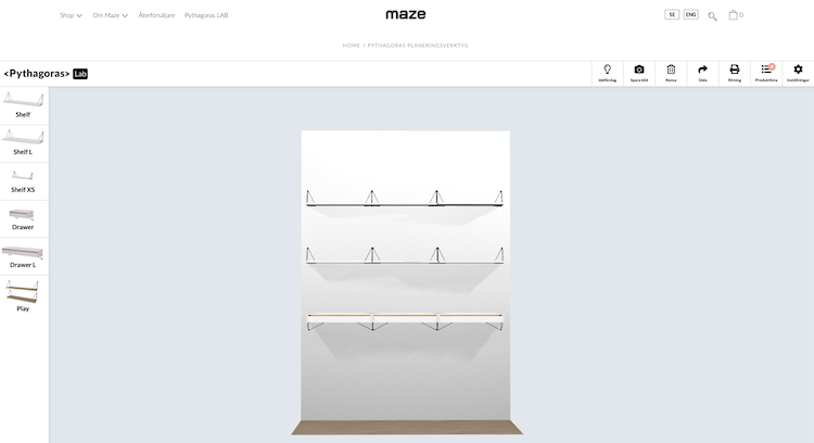
For the shelves, we opted for the Pythagoras Collection - a shelving system which allows you to arrange brackets and shelves in numerous ways as well as choose between different colour and material combinations. 

For the design, we used the online Pythagoras Lab to plan the layout. 


We were keen to have both open and closed shelving and incorporated this into the plan using a series of shelves and drawers - all in white ( you know me!). 

Putting up the shelves
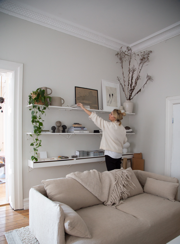
Once the shelving had arrived (it's made in Sweden so it was all pretty swift!), we marked out the wall using old school post-its and a ruler (yes, so old school, I know!). 

It's worth noting that the studio building is well over 100 years old so the concrete walls are pretty wonky, crumbly and all-round tricky! So, for the sake of creating a sleek look (and saving the walls from being at the mercy of my very basic DIY skills) - we roped in the help of a local carpenter. 

Contrary to the original design, we decided to place the triangular brackets in different ways, creating a subtle playful look. I'm so pleased with how that's turned out. 

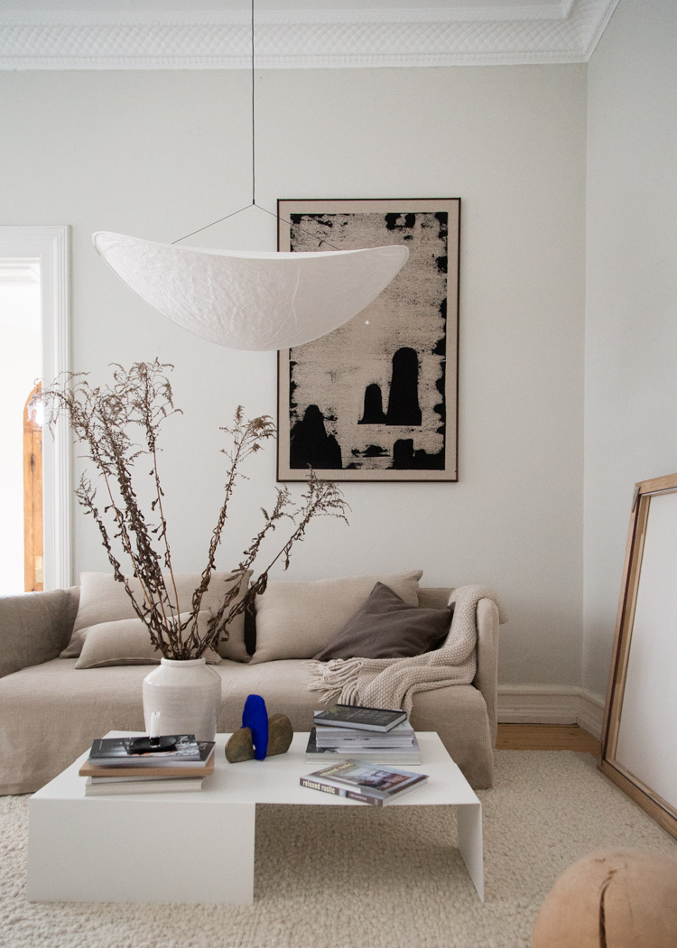
Sidenote: I went out to buy a spot of lunch last week and came back with the print and frame from a second hand shop, such a find I think! 

The final look

I love it when a plan comes together! 

To finalise the look, the sofa was pulled out from the wall - ask a Dane about their favourite styling trick and many will tell you that you should never have your sofa flush against a wall (unless you live in a teeny space). Even moving it out 15 centimetres can make all the difference to a room! 

We decided to start the shelves quite high as we wanted to be able to store bigger items underneath - but if you don't have this as a requirement, you could also add one more shelf lower down. 

I particularly love the drawers - they're so handy.  

Another sidenote: The tile and wood floor samples are for my tiny cabin - I went for the stone on the left for the bathroom floor, I can't wait to see how it looks! Just above them you can see four figurines - all made by local artist Simon Vendin (the same guy who painted my new picture seen in the first and second to last pic of this post). Needless to say, I love this work! 


Magazine storage

We also felt it would be nice with some extra storage beside the desks (I don't know about you, but I always collect piles of paper, it seems to be my nemesis both at work and home!).  The wall-mounted Now S magazine rack is my new best friend! 

It's made from recycled wire and produced in Sweden and comes black, white or matt brass. If you have a ton of magazine and newspapers (or other paperwork) you might like the larger format, known simply as Now.  

Helena made the cup - she's so talented at pottery! 
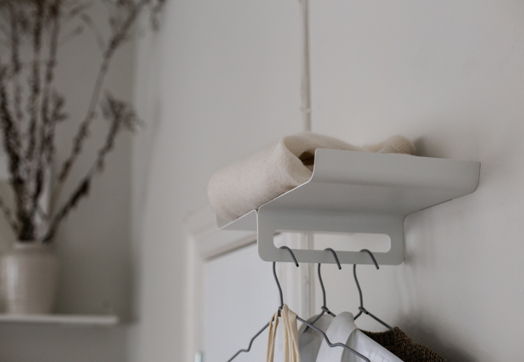
Coat & Hat Hanger


We also added a much-needed place to hang our coats (rather than throwing them over the back of the sofa!). This is the Kite clothes hanger (which comes in white, black or grey). I love the barely there look, plus it offers just enough storage.  If you need something that holds more items, it's worth checking out the entire collection of hangers and hooks

The room is feeling so much more practical, neat and complete now. We hope you like the update as much as we do! 

If you have any questions about anything you see in the pictures, please do give me a shout and I'll do my best to supply info, links etc! 

Right, I'd better crack on with some work - I've got piles of paper to get through! 

Wishing you all a great start to the week!  

Niki

Photography: Niki Brantmark  Styling: Helen Sturesson

Twitter FaceBook

Pin It
8

Before & After: A Rundown Cabin Becomes a Vibrant Danish Summer Cottage

It's safe to say that when Ida Lundsteen and Edward first bought their summer house in Ejby Ådal - an hour west of the danish capital - it needed a lot of work! But the handy Danish pair could see its potential - both inside and out - and set to work themselves to transform it. Today, their hard work has paid off and they have an idyllic retreat in which to unwind in their spare time. Read on to see the before and after pictures and feel truly inspired!

Dining area before

Dining area after

The wood panelling was painted white, and the floor sanded down and treated with a white soap finish. A window was added to allow light to flow through from the side extension. Today, the dining area is bathed in natural light - a perfect spot to enjoy meals on chillier days! 

Kitchen before

Ida and Edward reconfigured the house, moving the kitchen to an area in the sitting room - formerly occupied by an old electric heater. 

Sitting room before

Looking at the pictures above, you can understand the sheer level of work that they have put into the renovation - completely gutting parts of the house. 

In the sitting room they added a lovely nook (with storage) in which to unwind with a book.   

Sitting room nook after

Bathroom before

Bathroom after
The small bathroom was completely updated. The sink was moved to the opposite side of the room, tiles ripped out and a new floor laid. Today it looks fresh and modern in black, white and brass. 

Side extension before

Side extension after
Ida and Edward built an extension onto the side of the house - adding a work space and practical mudroom. 

Garden and terrace before

Life at a Scandinavian summer house is all about enjoying the great outdoors. Doors are thrown open in the morning - and life spills outside to take in the long summer days. 

But for Ida and Edward - there was work to be done. The garden was completely overgrown and although there had been some form of patio, it needed to be worked over from scratch.

The pair built a large wood deck completely by hand - almost doubling their living space in summertime. They also capitalised on sloping land by adding built-in seating to the side of the decking. 

But my eye is on the sunk-in bath. So simple, yet such a clever idea. 

Patio before

Patio after
After a lot of hard graft, clearing foliage, pulling up the old patio and creating new decking - the family now have a wonderful outdoor dining area where they can gather and enjoy summer days long after the sunsets! 

How incredible! It's even more impressive knowing that they did it themselves, don't you think? 

Is there anything that stood out to you in particular?

The decking before and after couldn't have come at a better time for Per and I as we were discussing laying our own decking up at the cabin this summer. We were already feeling inspired by Per's brother who laid decking himself last summer - and now, after seeing this, we're feeling really empowered! 

I hope this lovely danish cottage as given you plenty of inspiration too. You can see more pics over at @bare_byg.

Other Danish summer cottages to love: 


You also might like to check out the before and after archive for other renovations. 

And finally, I can't sign out without a final comment on the bath. I've seen many outdoor baths before (see 15 outdoor bath and shower ideas) - and the incredible wood burning bath at Settle hideaway, but this is the first time I've seen a simple, ordinary bathtub sunk into decking. What a great idea! I could just see myself having a soak there, glass of wine in hand. How about you? Would you like to see how it looks in winter? Here goes: 


Perfect! 

Niki

PS I mentioned yesterday that I would be sharing my latest studio update today, but the post isn't quite ready - sorry! I look forward to sharing it on Monday instead! 

Photography: Ida Lundsteen, shared with kind permission. 

Twitter FaceBook

Pin It
12

A Serene Stockholm Apartment In Neutrals

This incredible Stockholm apartment might seem tight in places (check out the angles in the kitchen and bedrooms), but don't be fooled - the two-floor maisonette actually has 5 bedrooms - which for Sweden's capital city is immense! When I stumbled across it, an incredible sense of calm washed over me, which I put down to the lovely pools of sunlight, wide open-plan living space and the soft putty shade throughout. I could quite happily see myself flitting about in this wonderful oasis, how about you? 

Note the rounded shape of the sofa - curved edges are set to be a big trend in 2022. 

I am guessing the fluffy rug is from Cappelen Dimyr - a popular Swedish brand co-owned by Elin Dixdotter who's wonderful Copenhagen home I featured here and incredible country kitchen here.


When you choose a monotone palette, it's critical to shake things up a little and add interest with texture - clearly seen here in the bedroom. 

So beautiful! 

I know this type of monotone look isn't to every taste - how do you feel about it? 

Tomorrow I'm hoping to share some snapshots from the latest update I have done in my studio - I hope you're going to like it as much as we do! 

Vi ses! 

Niki

Photography Nestor Fastighetsmäkleri found via Nordroom with thanks. 

Twitter FaceBook

Pin It
4

A Swedish Apartment with a Great IKEA Hack - and a Small Pink Bedroom!

Today I'm taking you on a journey to an apartment dating back to 1900 in the boho district of Södermalm, Stockholm. What caught my eye about this wonderful Swedish space (apartment from the sky-high ceiling and big windows, of course) is a great IKEA hack, the choice of colours - and a cosy, small master bedroom - as well as various other factors! Ready to take a closer look? 

I love the placement of the dining table by the window. In a capital city outdoor space is limited if not non-existent - and I am already imagining the windows thrown open in summertime, giving the illusion of dining alfresco. And in winter, any tasks at the table can be carried out under the natural daylight. Perfect! 

THIS is the IKEA hack I was talking about. I have done exactly the same thing in Liv's bedroom. The IVAR cabinets are from IKEA and have been painted to match the wall and then wall-mounted. So simple and yet so lovely - plus they're nice and narrow so can fit just about any space. 

I love the print too - anyone have any idea who it's by / where it's from? 

A cosy sitting room area has been created further from the window. Notice how the gallery wall helps to create a separate zone. 

The master bedroom may be small - but it's also very cosy. I love how the windowsill doubles up as a bedside table on the far side and the pink hue helps to add a soft, romantic touch. 

A lovely space!

Oh, and it's currently for sale.... just saying! 

Is there anything that stands out to you about this home? Could you imagine going pink in your bedroom? I'd love to hear your thoughts!

Other homes in Södermalm you might love: 


Niki

Photography: Fredric Boukari 

Twitter FaceBook

Pin It
9

Subscribe To My Scandinavian Home

Subscribe to My Scandinavian Home

skovby ad


site by ANAAR

This website uses cookies to ensure you get the best experience on our website.
MORE INFO