A Peek at the Lights in My home and Studio!


Sponsored by HVLG International. All words and pictures are my own.

Do you find that when it comes to decorating a home, there's always some items that are easier to buy than others? And it's so personal! While I might be less good at sourcing rugs, I have a huge passion for lighting and it's one area of our home that I have fully covered! Could it be the dark Swedish winter? Or perhaps that I see lighting like art? Or maybe it's the huge variation waiting to be discovered. Either way, I'm always on the hunt!

Last week, I added three beautiful new gems to my home and studio from Hudson Valley Lighting Group International. While this was purely an instagram collaboration, I'm so happy with them, I thought maybe you'd like to see the gems here on the blog too! 

At home


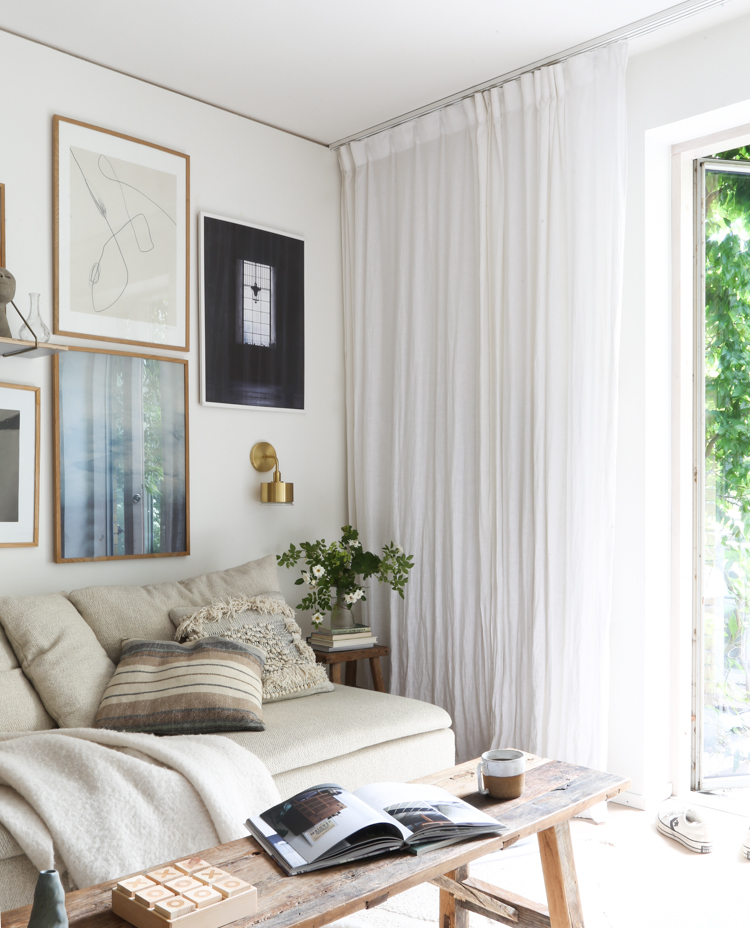
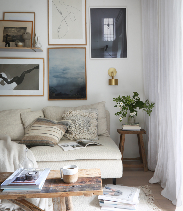
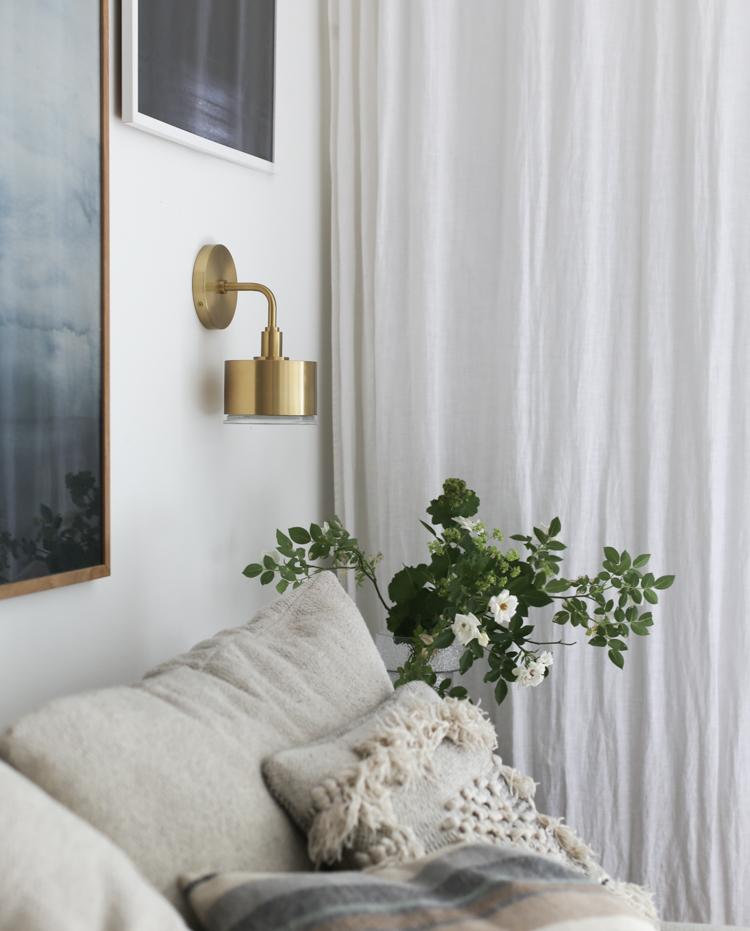
In the corner of our sitting room I added the Nora wall sconce by Mitzi. I was drawn to it because it's like a jewel, brightening up what can be a fairly dark corner. It's also not too big which is great, as behind that curtain is our flatscreen TV and my children wouldn't be very happy with me if something were to obscure their latest series! Oh, the decorating struggles! 

This is the brass version, but it also comes in nickel if you prefer a silvery finish! Oh, and it's also suitable for use in the bathroom. You might recognise the style as Liv has a matching Nora pendant in her room (take a peek here). 


In the studio


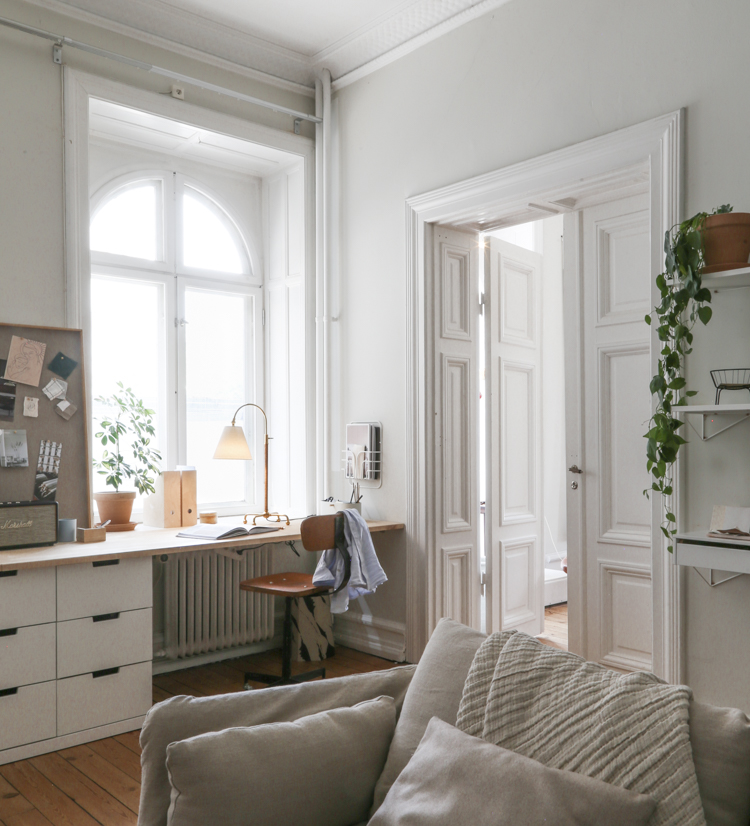
A few years ago I made the big move out of my home office to a studio in the centre of Malmö, and I've never looked back! It certainly helps that I share my studio with two lovely, talented ladies (so many laughs as well as support and words of encouragement). 

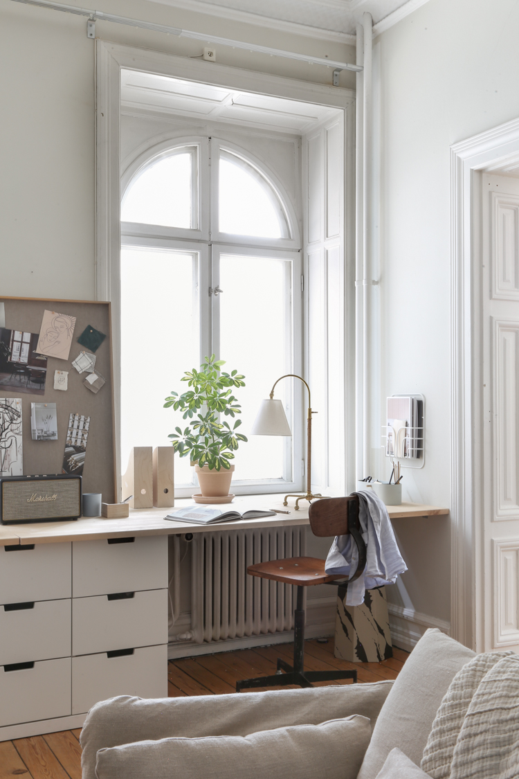
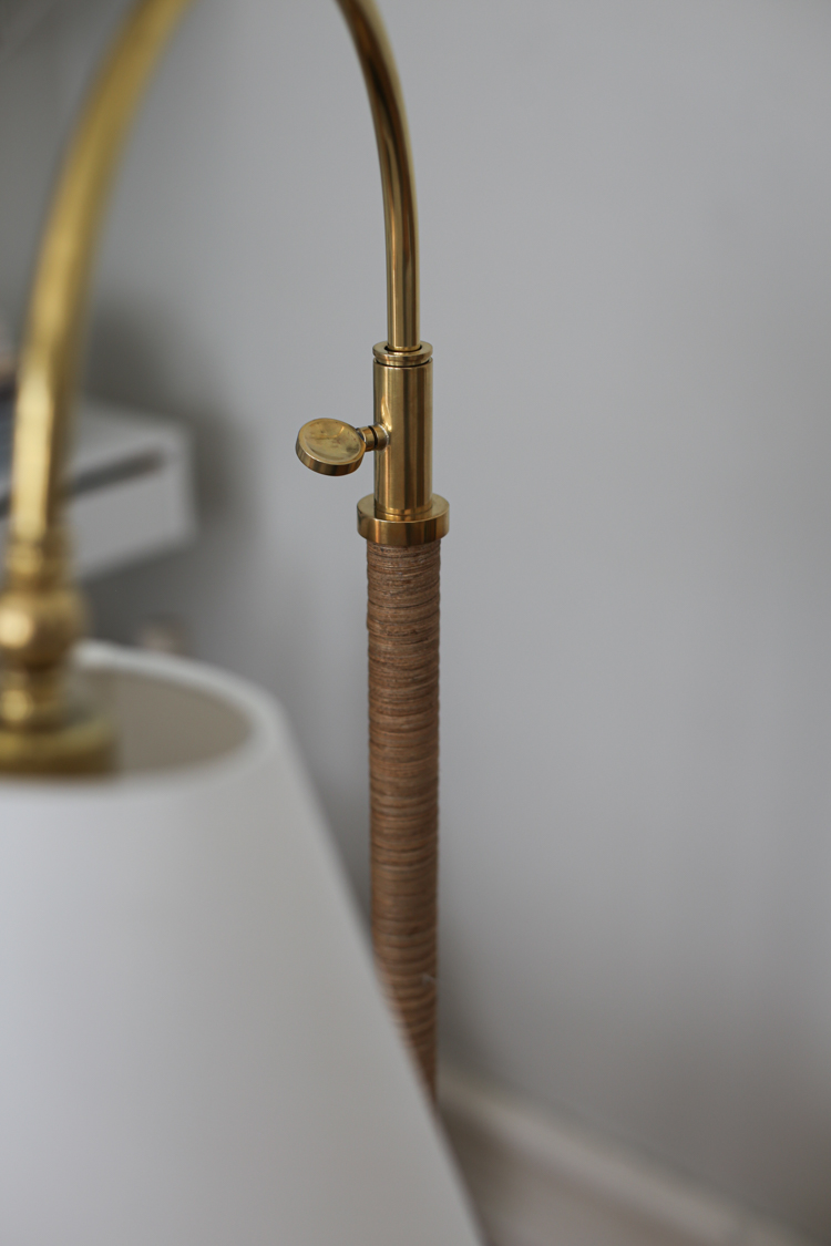
Last week, I set up this Curves No.1 table lamp on my desk, and I have to say there was a lot of excitement 'Oohing and Ahhing' as we gathered around to admire it. The brass, rattan and linen details are beautiful! It's not all only aesthetics though - the height is adjustable and the lamp swivels, so it's highly practical too! 

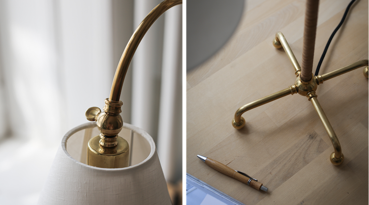
Here's a closer look at the fine brass base and details.

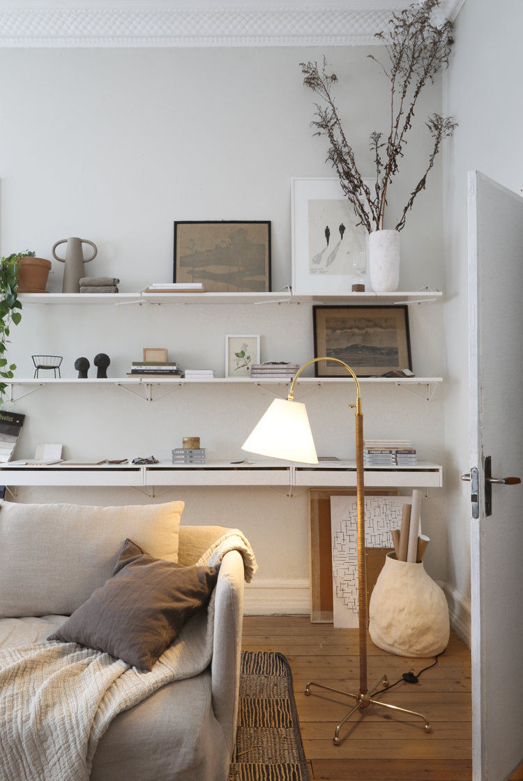
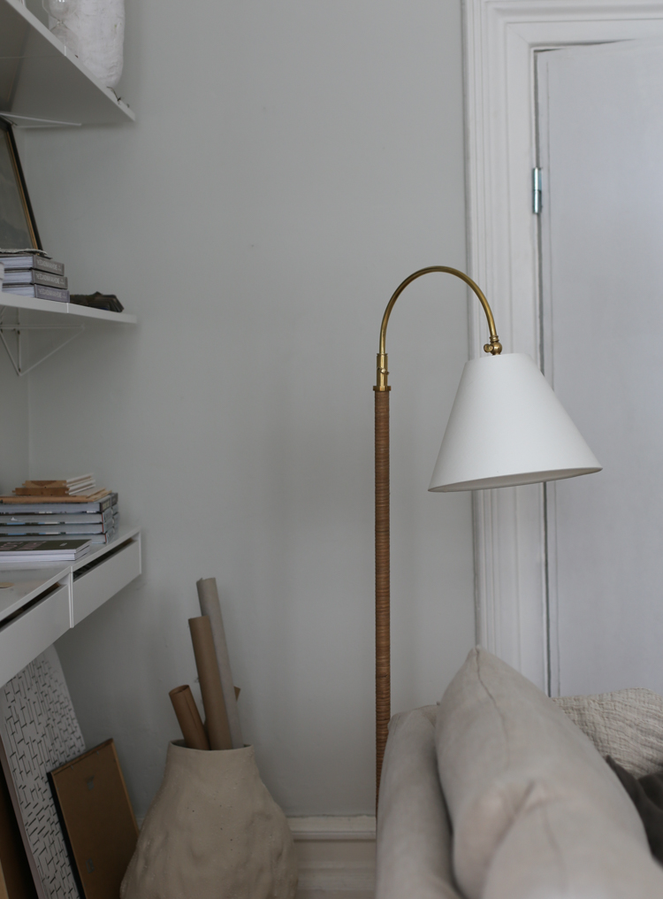
You might also be excited (I was) to discover this table lamp has a sister - the  Curves No.1 floor lamp. Which now stands proudly beside the studio sofa. 

I was so happy to discover that this lamp was equally easy to put together - it took seconds for it to be up and running (I'm not one for a major amount of fuss, are you?). 

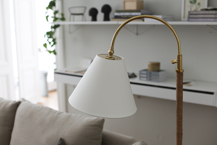
The lamp features the same brass and rattan details. And I love that it combines traditional touches with a modern aesthetic. It could fit in anywhere and be moved around at whim! 

It also features a foot button to turn it on and off - big bonus in my eyes! 

I hope you like these lamps as much as I do - and have enjoyed a peek inside my home and studio today.

You can read discover more about them and see the full collection at Hudson Valley Lighting Group International (ships worldwide).

You can also see more of their lamps throughout my home and cabin here: 


Feel free to ask about any other details you see in my home and studio and I'll be happy to help in the comments below! 

I'll be back on Friday with a beeeeeautiful home tour. See you then! 

Stor kram!

Niki

All words and photography my own ( Niki Brantmark / My Scandinavian Home) 

Twitter FaceBook

Pin It
4

An Incredible Workspace / Studio and Gallery in Delft Holland

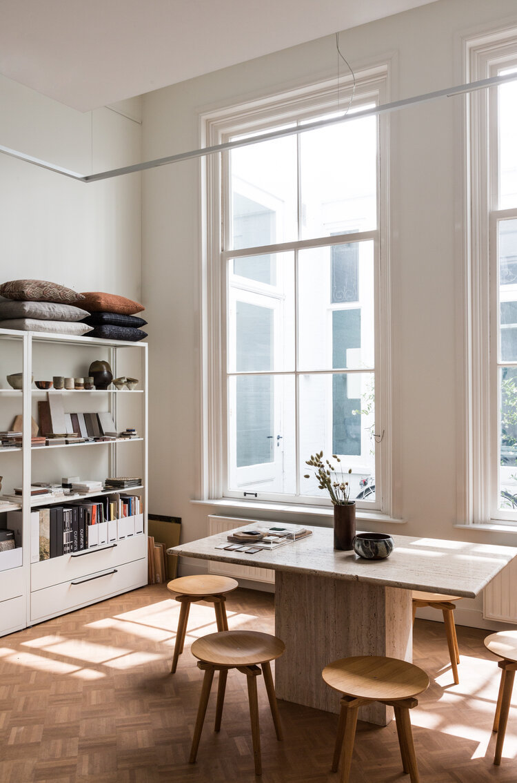
Many moons ago interior designer and photographer Holly Marder of Avenue Design Studio came and shot my home for a magazine feature and we've been in touch ever since. Not only is Holly a lovely, funny person, she's also amazingly talented. Every interior she touches turns to gold and I've featured so much of her interior work here in the past. I was so excited to discover that Holly recently opened a new studio and gallery space in a Dutch canal house in Delft, Holland. The building itself is incredible and boasts soaring ceilings, sash windows and an original parquet floor. And true to style, Holly has used the natural light that floods through the windows as a backdrop for a gallery of "curated collection of art, objects, furniture and design" as well as a design studio. Ready to feel inspired? 

The design studio

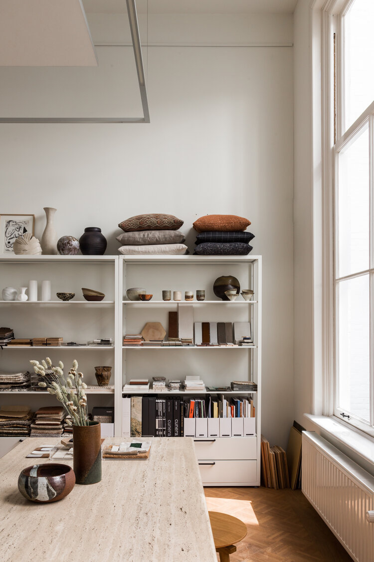
I remember when Holly worked from an attic space which doubled up as a guest room. Naturally it was a lovely space - even so, I think we can all agree that the new Avenue Design Studio headquarters is a step up! Connected to the gallery via an outdoor patio, the space is used for presentations, meetings and consultations surrounded by a "rotating collection of curated objects and art which are collected for projects in the process of being finished" as well as samples and materials. 


The magnificent studio table is a travertine piece which has been custom made for the studio. A large mood board (try Ferm Living for similar pinboard) serves as inspiration for various residential interior design projects. 


Gallery by Avenue

Holly is forever sourcing unique pieces for projects as well as collaborating with artists, so a gallery space next door was a natural progression and a long-term ambition. 

The gallery, which is open to the public (I need to visit ASAP!), showcases a collection of vintage and contemporary design as well as furniture and objects designed in the studio. Think earthy tones, natural and tactile textures and a serene look and feel. 

How beautiful! To think people work in spaces like this - gaaaah!

I'd love to visit the gallery too - the only problem is I'd want to buy everything so it would be very dangerous! 

You can see more Avenue Design Studio projects here.

And Holly's own living spaces:

Looking to revamp your home office or workspace? There's plenty of small space inspiration here: 

And other, larger studios / workspace inspiration here: 

And of course, I can't resist including a link to my own studio in Malmö. I moved in three years ago having worked from home for several years. It took me ages to decorate it, and I'm even doing a bit of a reshuffle here tomorrow (you know me!). I can't wait to share more pictures with you soon. In the meantime, you  might like to see the behind-the-scenes tomorrow over at @myscandinavianhome stories. 

That's it from me this week friends! Thank you for your kind comments, I'm so happy you've enjoyed the tours this week (if you've missed them, hit the 'older posts' button below - they're not to be missed!). 

Have a wonderful weekend! 

Niki

Photography: Avenue Design Studio / Studio Artspret / Fanny Hååg / Rachel Terpstra 

Twitter FaceBook

Pin It
2

My Studio Make-over (And How One Sofa Helped Transform the Space!)


Paid partnership with Bemz - thank you for supporting the Nordic brands which make My Scandinavian Home possible

When I first started my business I worked from home. I'd have the washing machine whirring in the background and other working-from-home neighbours stopping by for a cuppa (I'm sure many of you can relate these days)! For a while I loved it, but over the years I started to miss the companionship that comes with being around others and two years ago I moved into a beautiful studio space in town.  It's run by upholsterer extraordinaire Carina Grefmar and we also share the space with Helena who works for a Swedish furniture business called Maze. Needless to say a whole load of coffee goes down on a daily basis!

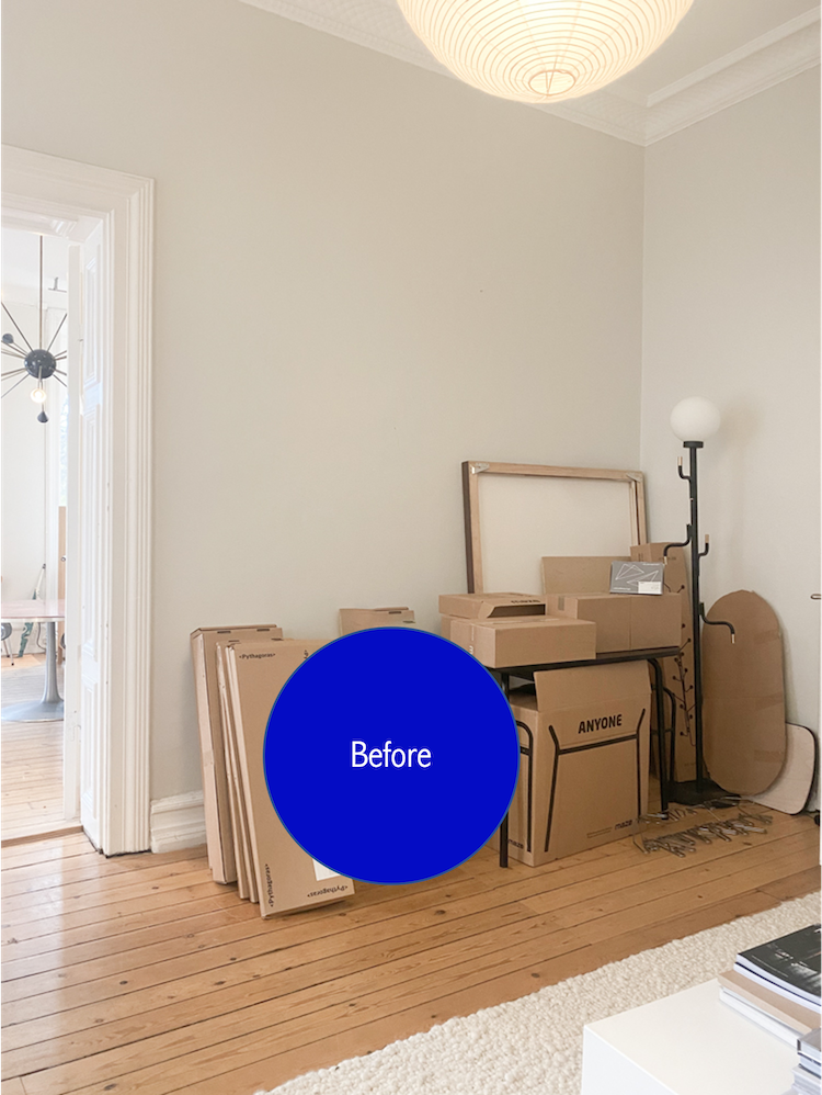
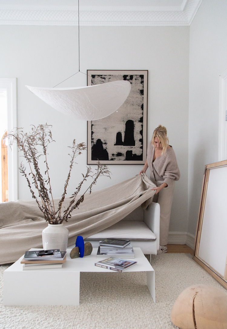
The only thing is, the room I share with Helena was still pretty much unfurnished save for one Söderhamn sofa and a whole load of boxes! It had becoming increasingly embarrassing, not least because we both work in the world of interiors! And then Bemz launched a Minimalist Fit design cover for IKEA sofas and everything was about to change! 


This side of the room had become a bit of a dumping ground for samples, props and other items. The problem is, once you start with one item, everything else seems to quickly gather - do you find this too?  


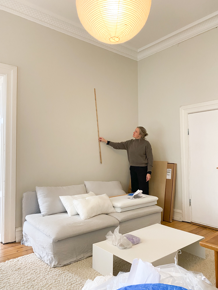
I sat down with My Scandinavian Home interior stylist Helen Sturesson (above with her trusty ruler!) and we hatched a plan. 

What we did

You are likely familiar with Bemz as I have partnered with the Swedish brand for many years. I simply love the entire concept. I mean, beautiful designer covers for IKEA armchairs and sofas in a choice of different high quality fabrics, what's not to love? It's the perfect way to give an old piece a whole new lease of life. 

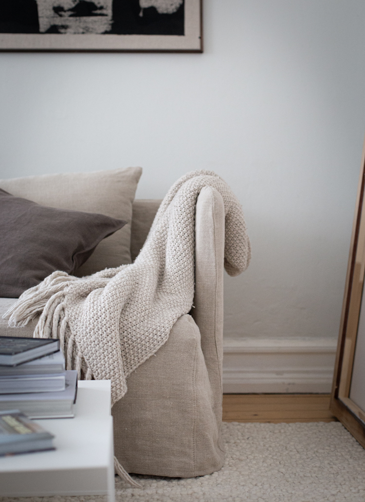
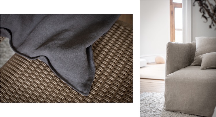
The new Minimalist fit cover differs from their loose and regular fit covers as it doesn't require you to take apart the sofa, you simply pull it on over the top. And it comes with or without arms - in this case I decided to add arms to my sofa for a smarter look (cue a morning at IKEA!). 


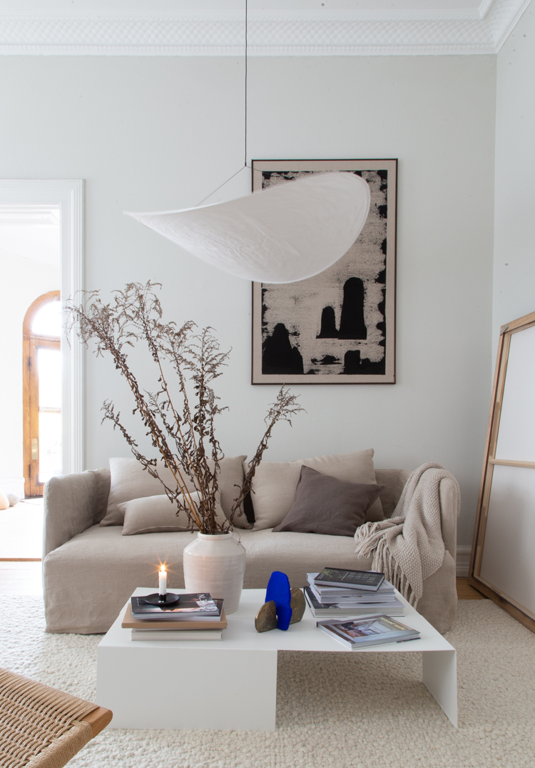
I love the Pebble tone, the soft linen texture, the seams - everything! Isn't it pretty? I also picked out some cushion covers in Brera Lino Cocoa with French Seams

To finalise the look I also added quite a few pieces made by local Southern Sweden designers as well as friends from further afield. Here's a quick round-up in case you're curious:

'Landscape', vinyl paint on linen by local artist Simon VendinDesign of Edge coffee table, Sculpture from the SANT series by Malmö based Karolina Brobeck & Mini Karami, branches from my friend Sarah's garden (she left secateurs on the doorstep!). 

And from further afield: Tense Lamp by New Works (thank you to local store Svenssons for sourcing this!) and the Palus rug from Armadillo


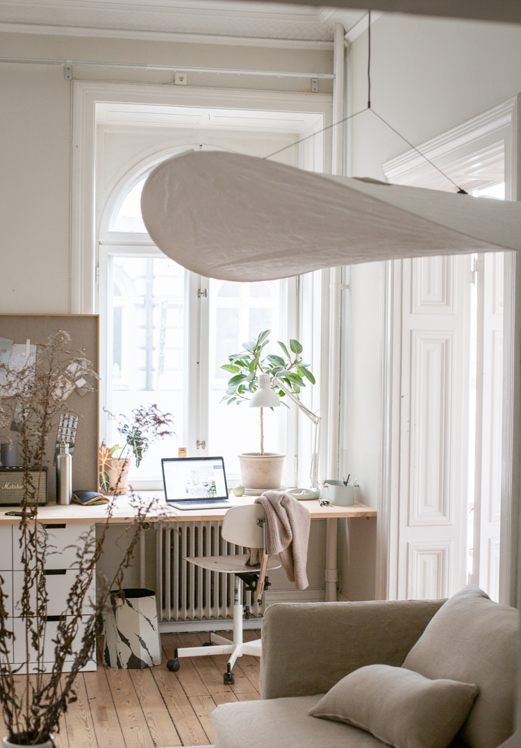
Our desk space in the window is made from several large planks from a local DIY store. I love looking out over the majestic buildings in central Malmö - there's always something interesting to see.

Finally a space we can be proud of! Wohooo! 

I'm so looking forward to plenty of fikas (swedish coffee with cake) - if you're in the area, please do drop by, there's always a coffee pot on the go!

Curious about getting a Bemz design cover for your sofa or armchair? Keep an eye out for the Black Friday sale over at Bemz this week. Here are some of my favourite covers in action


I can't wait to show you the rest of the room once it's finished - this girl is on a mission now! 

Have a cosy day! 

Niki

Photography: Niki Brantmark / My Scandinavian Home
Styling: Helen Sturesson 

This post is brought to you in paid collaboration with Bemz and contains affiliate links. However, all words are my own and I only ever work with brands I absolutely love and think you will too. Thank you for supporting the Nordic businesses that help bring fresh content to your mail box and make My Scandinavian Home possible.

Twitter FaceBook

Pin It
8

Surfs Up At A Boho Studio And Holiday Home Hideaway

How wonderful would it be to work for a few hours and then head out for a surf? That's exactly the set-up Dee Kawai Tang has created at Kawai Heart Studio! Located on the wild coast of Australia on the edge of Fremantle, the atelier was hand built in the 90's using recycled materials and has been lovingly converted into a light-filled photo studio and guest cabin - a few hundred metres from the sea. The family also rent out Lady California Bungalow a beautiful art-deco style property filled with natural light and birdsong. Here are a few snapshots of the two spaces. I could just imagine heading here to write a book (I've always loved the idea of a writer's cabin!), chill or simply head to the nearby beach - how about you? Oh and, please tread quietly - sleeping baby alert! 


How incredible! This relaxed style is right up my street. I'm pretty sure I could find a great rhythm of sleep, work, surf... how about you? 

See more of Kawa Heart Studio and take a peek inside Dee's own home over at @kawa_heart_studio

For more workspace / atelier inspiration check out:


Speaking of holiday home rentals, I'd be so happy if you could take the time to fill in this very quick questionnaire for me. It's a business idea I am thinking about developing and I'd absolutely love to get your thoughts if you have the time. You can find the survey here

Wishing you a lovely day!

Niki

Photography courtesy of @kawa_heart_studio found via SF Girl By Bay with thanks. 

Twitter FaceBook

Pin It
0

Beautiful Danish Lamps In My Study - In Shades of Toffee and Smoke

Brand news: 
A few weeks ago, I showed a beautiful photographer's home from the Danish island of Bornholm - and it was a perfect reminder of the sheer creativity on the island. As you're aware, one of my favourite 'makers' is located right there in the Baltic Sea: Pernille Bülow. I absolutely can't get enough of her mouth blown SKY lamps, and Per is mesmerised too (always helpful when the man is on board too, don't you think?!). A few weeks ago Pernille Bülow launched three new beautiful shades: Smoke, Toffee and Green. As a fan of all things earthy, I immediately reached out about the toffee and smoke variant to hang in my home office along with hate clear version I already have. It was like everything just fell into place. Don't you love it when a plan comes together?! 

The mouth blown glass pendants all have unique organic shapes and feel so beautifully smooth. I love the small imperfections too as they show that they are individually made in the atelier. 

For this cluster I have used: Smoke large, Toffee medium, Clear gold medium.  


You can choose between brass / gold or chrome / grey fittings (I love the former for my home) and if tones of brown aren't your thing there are 11 different colours to choose from (they also look great hung individually). 


I love it when a plan comes together! 

Could you imagine having the these beautiful lamps somewhere in your home? 

If you're curious about where else you might be able to hang them, check out how they look in other areas of my home (and in various shades):


FYI they ship worldwide

I love my little home office even more now. In other news: Per is teaching from home right now and there's always a little tussle over who sits here. So, this week I'm turning the window nook in our bedroom into a home office / study just for him. Keep an eye on the blog for the results (and hopefully, one very happy man). 

Niki

This post is brought to you in collaboration with Pernille Bülow, however all words and pictures are my own. Thank you for supporting the wonderful businesses that make My Scandinavian Home possible! 

Twitter FaceBook

Pin It
5

My Malmö Studio: New Gallery Wall!


If you stopped by on Saturday, you'll have seen a first glimpse into my new studio in the centre of Malmö. I moved in last September and can't tell you how great it is to have a permanent desk somewhere out of home  - I was honestly climbing up the walls! I share it with upholsterer extraordinaire Carina Grefmar and designer and CEO of Swedish Ninja Maria Gustavsson - both such talented, inspiring ladies! It was an empty shell when we first got it and Maria and I set about making the desk. This week I finally put something on the wall too: a gallery wall thanks to Posterlounge who sell thousand upon thousands of posters and prints!

Designing The Gallery Wall
I'm always a little cautious about creating a gallery wall since it involves a whole lot of drilling, so I played it safe by designing it on my computer and then using recycled paper, nails and a spirit level before hanging the pictures!

The Prints
I've been feeling so inspired by Danish gallery walls lately. They often have a relaxed, eclectic vibe going on and not afraid to incorporate colour and pattern. I went through the Posterlounge website picking out all the prints I loved and then narrowed them down to a selection which worked well together. I also combined white and natural frames.


Get the look


1. Scandinavian design with marble and gold by Radu Bercan
2. Watercolor Lines in Blue I by Nouveau Prints
3. The Good, The Bad And The Ugly by chungkong
4. Picture frame LOFT (White)
5. Angel by Paul Klee
6. Composition trees I by Piet Mondriaan
7. Adjacent Abstraction I by Emma Scarvey
8. Picture frame LOFT (Natural)
9. Composition in Black and White by Piet Mondriaan

Thank you so much to Posterlounge for helping me feel even more at home - it's amazing how art can transform a space!

If you'd like to add more art to your walls, the fab team at Posterlounge are offering My Scandinavian Home readers a 10% discount with code SCANDI10! Woohoo! Do share if you create your own gallery wall, I'd love to see it!

Next step... a rug. Watch this space!

Niki

This post is brought to you in paid collaboration with Posterlounge, however all words are my own and I only ever work with brands I love and think you will too. Thank you for supporting the businesses that make My Scandinavian Home possible.

Twitter FaceBook

Pin It
4

Subscribe to My Scandinavian Home

skovby ad


site by ANAAR

This website uses cookies to ensure you get the best experience on our website.
MORE INFO