


It takes a lot of imagination, vision and patience to take on an apartment with quirky angles. But fortune favours the bold, and Danish pair Mikala and Mark Brunsvig (an artist) were willing to take on the challenge! Located in the hip Copenhagen neighbourhood of Nørrebro the apartment is located on the fourth floor of a block dating back to the 1800s. Mikala and Mark were keen to create a personal, cosy and relaxed home which is also highly practical. Measuring 76 sqm (818 fsq), the creative couple have ensured no space has gone to waste - creating a series of zones and using every nook and cranny for storage. The result is a warm and inviting home filled with books, art, vintage finds and splashes of colour.
It's not often I start with a floor plan, but today, I thought it might be helpful to understand the layout and angles before you take the tour.

Quick Danish glossary; køkken - kitchen, stue - living room, værelse - room, altan - balcony.
Now that you've had time to study the lay out , it's time to enjoy the tour!


There are just SO many ideas to steal from this lovely apartment. I've been through it several times and always spot something new!
Above all else, I love the feeling you get from the pictures - the home oozes charm and a wonderful sense of ease.
Is there anything that stood out to you? Perhaps something that has given you an idea for your own home?
I've got an exciting long weekend ahead with a trip to Kullaberg, Helsingør and Helsingborg on the itinerary (do follow along on my Instagram stories if you'd like to see one of my favourite corners of south Sweden and Denmark!). But before I shoot off, here are a few other homes of Scandinavian artists:
Beautiful!
Wishing you all a wonderful weekend!
Niki
Photography: Mikala Brunsvig
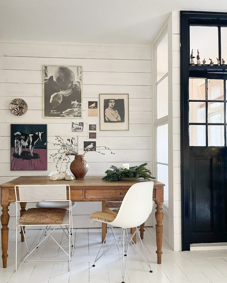
I love the odd angles--so unique! They did a marvelous job of creating storage--especially for all their books. I like the quirky touches--are those gnomes in the first picture? And what is the man in the photograph eating? :)
ReplyDeleteThat is a photo of Pablo Picasso eating fish, probably sole, ¡with his hands! Ohhhhh, his Spanish mother wouldn't be proud of his table manners!
DeleteThank you!
DeleteGreat post! And thanks for the floor plan, would love to see one more often. Also, trying to do the math here and living on 78 sqm in a two storey cottage myself, there is no way this apartment is more than 50 or 55 sqm max. - But lovely, great use of space, super cosy!
ReplyDeleteAnd it is less than 78 m2. In Denmark they calculate more into the square meters than just the mere apartment space. If I remember correctly, it's the balcony and part of the staircase.
DeleteI have always had a thing for rooms with angles and this apartment totally tickles my heart. It reminds me of my bare bones apartment in Prague many years ago, there was only a kitchen, bathroom and a 1 large room but it was diamond shaped with one corner cut off but it was mine and I loved it.
ReplyDeleteThis apartment is gorgeous - looks of beautiful corners, nooks and crannies.
The layout of this home is irregular to be difficult to design but you've made a success! Dispite the kitchen floor tiles, I like everything.
ReplyDeleteI am so drawn to this apartment that I am looking at it for an umpteenth time. I noticed only now that some of the items in the 'gallery wall' (in the leading photo) are displayed in two different places. So were they rearranged just for the purpose of the chronicling the apartment? I doubt that the owners have all of these in duplicate.
ReplyDeleteAnd can somebody tell me what would the style of the black & white plate (left of the Picasso photo in the lead image)? If I wanted to explain somebody that this is what I am looking for, what would be the term that would be characterize the piece?
I really loved the piles of books. Keeps the view calm but still easy to turn them around to see the titles when there is negative space between the piles. So smart!
ReplyDeleteEverything is bright and seems new; untouched is the effect. Nicely done!
ReplyDelete