Don't you love a great before and after? I always find them so inspiring, but I rarely show the 'before' on My Scandinavian Home. So I thought I'd turn over a new leaf. So friends, welcome to a new mini series exploring home make-overs at the hands of some of my favourite interior designers and the likes of you and me! Firstly, a HUGE thanks to Builders Bay for sponsoring the series (check-out their site if you're in the middle of a renovation - it's every builder's little black book!).
I felt we needed something kind of fabulous to kick off the series - and this beaaaautiful home in Miami which has been given an overhaul at the hands of Avenue Design Studio fits the bill perfectly. The design process was a year and a half in the making (imagine?!) - and involved a tear-out, renovation and redesign of a two bed, three bath penthouse apartment! Wow! I caught up with my friend Holly Marder (one half of the talented design duo) to find out more.
What was the brief?
"The style direction for this Miami abode was fresh, contemporary and clean with a classic twist. We wanted to breathe new life into the space as a whole, open it up but at the same time ensure our client was left with a liveable, functional interior."
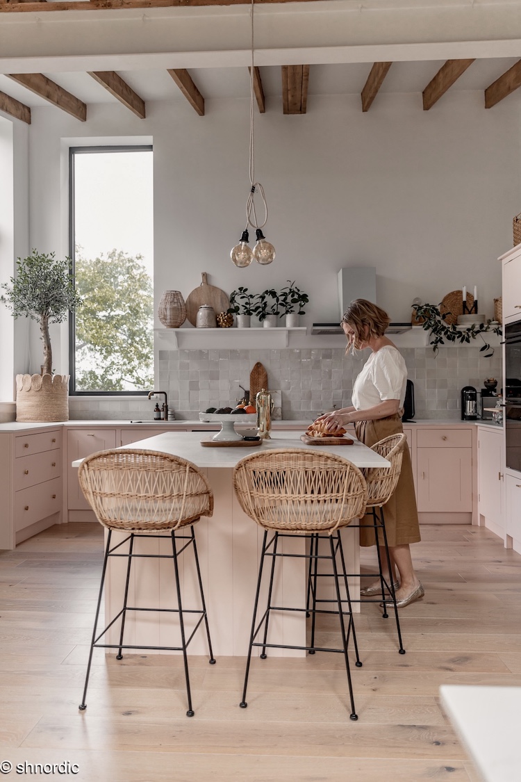
Open-plan dining and living area


What did you have planned for the dining / living area?
"As you can see we had mostly cosmetic changes to make, but I also felt that we needed to open up the spaces even further to allow for more light and a general flow. The living and dining area was large and spacious but the kitchen was small and the ceiling was low. We pulled out a wall or two, raised the ceilings in various places and then got started selecting all the finishes that would lay the groundwork for the renovated space, and overall the results are much fresher and lighter."
AFTER


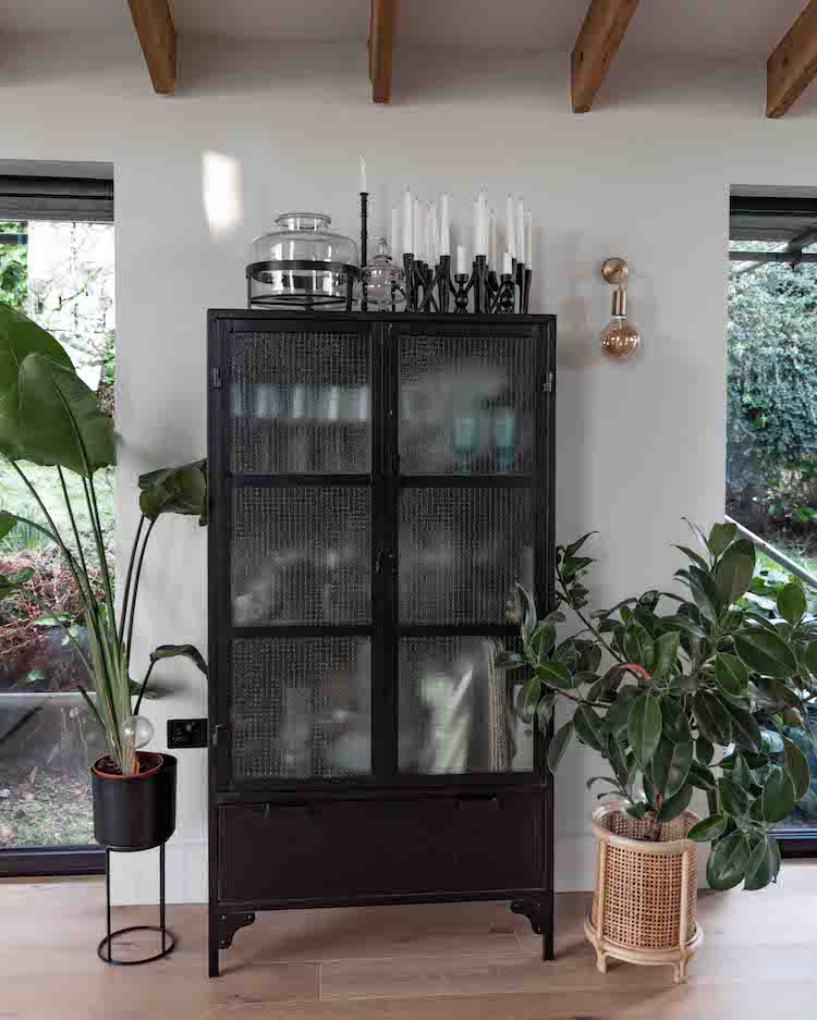
Can you tell us more about THAT fab storage unit?!
"To tackle our clients’ request for plenty of storage, we designed a wall to wall built-in cabinet flanking the dining table to house her dinnerware and glassware, linens as well as provide an interesting backdrop to her dining space. The goal with this design was to integrate it with the wall, as opposed to being a separate entity of its own and be ‘busy’ in the space. We wanted it to be streamlined and as flush as possible, and therefore opted to paint the whole unit the same colour as the walls (Origami White by Sherwin Williams) which turned out whiter than expected due to the finish applied to it. That said, it is fresh and clean and allows the accessories, and beautiful oak pulls from our friends at Design Studio NU, to pop off it while the large wooden table and sculptural Lambert et Fils pendant can stand out against a calm yet interesting backdrop."


Such a perfect dining area, don't you think? I especially like how the open shelves allow for displaying items you love and then you can shove less pretty / more practical things in the cupboards and drawers (also keeping them free from dust). Perfect!
Living room

What was your thought process behind the living room area?
"We wanted the living area to be a central part of the room, without being ‘heavy’ . The goal here aesthetically was calm, inviting, organic. We brought in many different materials including walnut and other woods, marble, wool and leather to provide interest and contrast. While we used many beautiful pieces that are noteworthy in the living room, the splurge piece of furniture was the walnut sideboard by German furniture label Zeitraum."


Loving this! I've so got my eye on that coffee table - and the side cabinet (can totally understand the splurge, can you?!
Kitchen

What did you have in mind for the kitchen?
"For our function savvy client we designed an all-American kitchen, featuring custom cabinetry, tons of storage, a breakfast bar and lots of light and flow. I worked with Aukje Schukken on the designs and sketches here in the studio, and after selecting the materials in person in Miami and ironing out the details, Dan’s Carpentry expertly carried out the designs locally."
The design


What were your goals for the kitchen?
"For the countertops our client wanted practical but didn’t want to skip out on looks. And why should she? We hand selected a beautiful piece of Macuava Calacutta quartzite that has the most gorgeous soft green-blue vein through it, much the way calcutta marble would. We looked at whiter marbles but couldn’t get past how pretty this one was in person so after our arduous and thorough search inside the stone supplier in 38 degree Miami heat, it was a done deal. The colour we used on the cabinetry is City Loft by Sherwin-Williams. We removed the wall adjacent to the front door and created a breakfast bar there. We also raised the ceilings throughout the entry, kitchen, halls and bathrooms."


Oh yassss! I think they nailed it, do you? Plus I could totally see myself with a morning coffee and a magazine at that breakfast bar, how about you?!
Tell us about the master bathroom re-design?
"The master bathroom was one of 3 bathrooms we designed, though due to time constraints we only shot the one. It was all cosmetic changes for the master suite as the existing layout worked well. As you can see from the below before shots it was a bit of a circus in there, or a zoo to be more specific. The previous owners had some fun with the walls and while we think a lot of creativity went into the monkey forest scene, we couldn’t wait to clean the space up and give it a fresh injection using quality materials, custom cabinetry and warm wood tones."

What were your plans?
"We continued the wood tile that we used throughout since it was so practical but still added such warmth to the space (which has no natural light). Seeing it in the bathroom I am still so pleased with the choice of wood tile we made. It was a tough task because most of them look manufactured but the movement, grain and colour of this one is so natural and in the bathroom is looks fabulous. We used a large polished stone tile on the walls around the bath tub, shower walls and baseboard, plus a beautiful striped matte tile on the wall between the bath tub and shower (that doesn’t show up as nicely in the image as it does in person – the texture is so beautiful in the space), polished quartz cararra counter top, custom walnut door and drawer pulls, and custom cabinetry painted in Benjamin Moore’s White Dove in the same ‘contemporary shaker’ style as the kitchen cabinetry featuring a walnut divider with integrated back and front storage."

And the result...


Oj oj oj (as they say in Sweden!), what a transformation! It just goes to show that it's amazing what you can do with a little vision (and the help of Avenue Design Studio!).
That's one lucky client, wouldn't you say?! Plus they have Miami on their doorstep too.... want to swap?!
Have a lovely day!
PS Do you have a make-over you'd like to share in this mini-series? If so drop me a mail!
Photography & Design: Avenue Design Studio
Thank you so much to Builders Bay for sponsoring this make-over series (if you're in the process of renovating or carrying out any DIY work, I can wholeheartedly recommend this site!).

* All words are my own, and I only ever work with brands and services I feel are of interest to my readers. Thank you for supporting the businesses that make My Scandinavian Home possible.
 11
11